A Responsive Website for a Chicago Wedding Officiant

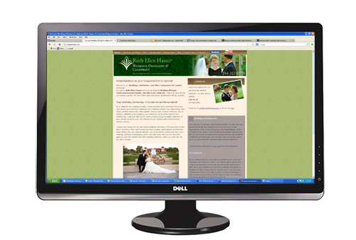
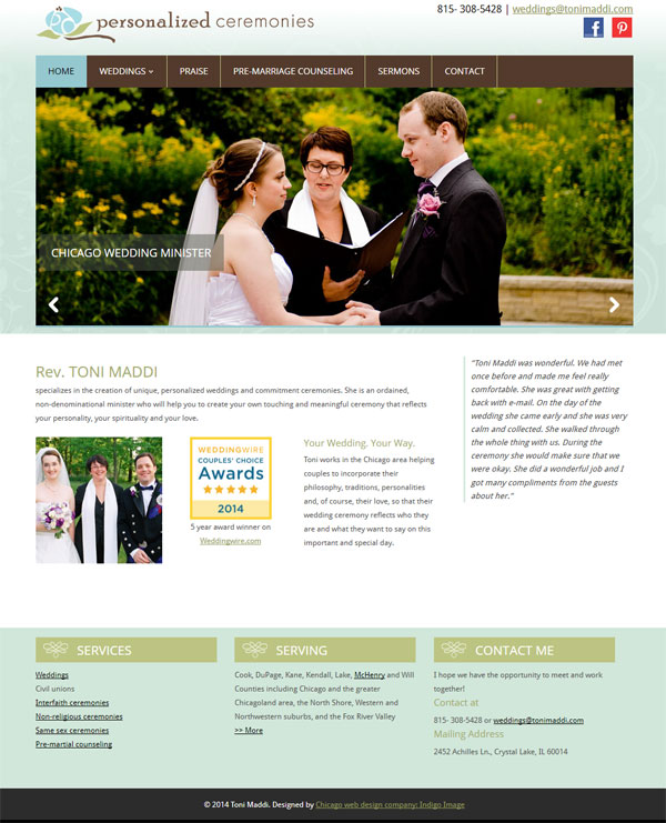
The website for a Chicago wedding officiant I gave a sneak peak to a few days ago is now live.

re designed website for chicago wedding officiant


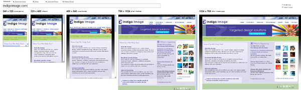
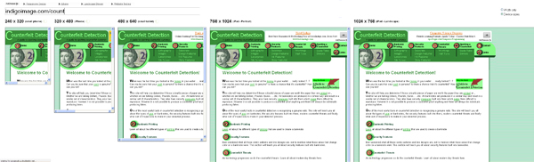
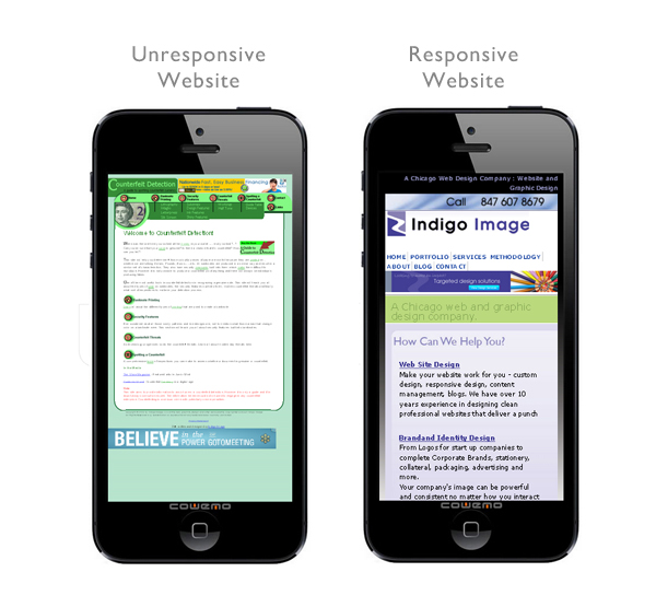
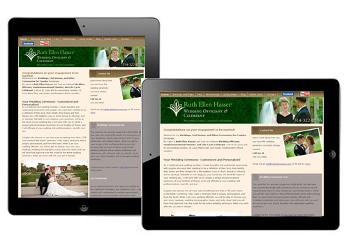
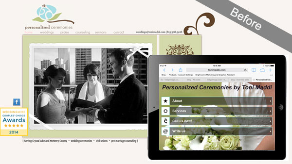
This was a re-design project of an original site that had been created on Wix…an easy to use website creator but lacking in functionality and true  internet marketing (SEO) capabilities. Here is a quick snap shot of the site prior to redesign, note the mobile version looks completely different from the desktop version.

website wedding officiant chicago redeisgn

Client, Toni Maddi , was very keen to keep the ability to update the website herself but really wanted a site where she could have full control of SEO. WordPress was the natural answer and it was this platform we used to build a fully responsive website for her wedding officiant business.

We created a very clean looking template design and updated the color palette a little. Toni had lots of fabulous photographs of wedding ceremonies she had conducted and these were used liberally throughout the site. All the pages were optimized for the search engines and we built specific landing pages for the locations and areas she serves.

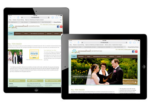
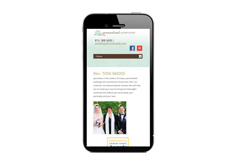
The template was coded to respond to whatever device was being used to view it giving the visitor a consistent experience regardless of device they were using.

Here it is on an ipad

responsive design chicago wedding minister

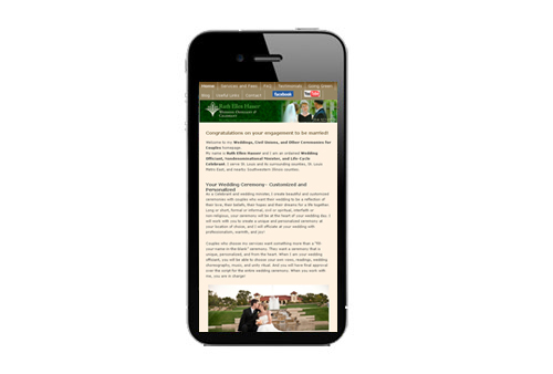
and again on an iphone

responsive design Chicago wedding minister
The site has been live for less than 24hrs but I have just heard from Toni that she has already received an inquiry through it!

Read more about this wedding officiant web site on our website design portfolio

New Website in Progress for Chicago Wedding Officiant

I am currently working with Chicago Wedding Officiant, Toni Maddi, on the creation of a new website for her business Personalized Ceremonies.

wedding officiant web site

Toni is looking for a responsive website that will improve her rankings in the search engines. I am building on the WordPress platform..the site will be launched in the next few weeks.

New Website for Heinzen Smith Properties

Client Margaret Smith, of  Heinzen Smith Properties, has a 150 year family history of building homes just north of Chicago. Each house is custom designed and blends beautifully with existing homes in the Wilmette area.

Margaret contacted us with lots of ideas for her web site and we have been able to translate those ideas into a site that perfectly captures what she wanted to achieve.

Home builder wilmette IL Chicago

After developing a color palette inspired by a slate roof with weathered copper gutters, we designed a home page which gives site visitor a quick glimpse of some of their most eye catching homes and focuses attention to New Homes for Sale.  We were spoiled for choice when it came time to select  photographs as the client provided so many stunning homes to pick from. Not wanting waste an opportunity to showcase them further, we carried them through to the inner pages of the site and cropped them to center on doors as a “welcoming” gesture.

chicago home builder website

The site was also designed and coded as one that is fully responsive – see here for an explanation of responsive web design

Here it is on a desktop

responsive web design chicago
On an ipad in portrait and landscape orientations
reponsive web design chicago
And finally an iphone
responsive web design chicago

You can visit the site at heinzensmith.com

Three questions to consider for mobile friendly websites

How much traffic is my website getting from devices like ipads and smart phones?

While you may not know the answer, I can guarantee it is more than you were getting a few years ago.  A quick look at the statistics for our own web site shows a 100% increase in the amount of traffic we are getting from mobile devices in just the last 12 months. A personal site I write, creativeinchicago.com, derives 40% of it’s 35k monthly traffic from mobile devices. Numbers like these are difficult to ignore and there is no doubt that mobile access  is a growing trend that is here to stay.

What does my site look like on mobile devices?

There are quite a few online tools that have popped up that emulate how a site will look on a particular device and while they can’t guarantee how you site will behave on any given device they do provide a quick snap shot. You can test your site on a simple emulator HERE . It will show you what your site looks like in different window widths, which is a simple but effective simulation technique –  to see which window size corresponds to which device click on the device sizes button.

A responsive website will adjust itself depending on the size of the window (or type of device) as shown with our site. This means that the site will be easy to use and offer the user an optimum experience regardless of what type of device they are using to visit from.

reponsive web desig in chicago.


A site which is not responsive will not adjust as illustrated in the site below. The simulator will display horizontal scroll bars in this case.

unpresonsive website

Most tablets and smart phones will actually shrink the website down to fit their screen instead of making the user scroll horizontally so the simple simulator used above is not accurate in that respect.

A more rigorous  simulator to try is Mobile phone simulator .

Here are the same two websites plugged in.

responsive and unresponsive web sites

The responsive site has adjusted to offer the user and optimum viewing experience but the unresponsive site offers tiny text and  unreadable navigation. These can be magnified  of course but the site makes the user really have to work to see it.

Can my website be converted to a responsive web site?

To behave responsively a website needs to be coded in a unique way. In many cases the existing design can be used, as in the case of a recent responsive conversion we carried out for ruthellenhasser.com. We made almost no changes to the overall design of the site but completely revamped the code powering it

RESPONSIVE DESIGN CHICAGO responsive_design_chicago_2 responsive_design_chicago_3

I am ready to move forward with a mobile friendly website

If you are looking to move forward either building a new website that is mobile friendly or converting an existing web site to behave responsively we are here to help. Call 847 607 8679 to get started today.

Chicago Web Design Company and Responsive Web Design

We have been offering Responsive Web Design services for quite a while now, so we really should take a rap on the knuckles for the fact that our own website did not behave responsively.

That is until now.

Client work always takes precedent over any other work, so that is our excuse for the tardy conversion of our site to a fully responsive website.

Our site is a great showcase of how an existing web design can be converted so that it behaves responsively – optimizing the users experience no matter what they are using to view the site, desktop, laptop, tablet or smart phone. We made no changes to the design or look and feel of the site but all the work was done on the code which powers the site – under the hood so to speak.

This is how it looks on a desk top,

responsive web design Chicago indigo image
here it is on a tablet,
responsive web design on ipad


and here it is viewed on a smart phone

responsive design on an uphone

You can experience this yourself just by re-sizing your browser window ( Firefox and Chrome work well for this).

Looking to convert your website into one that is responsive?

This type of coding conversion can be readily achieved on most websites. If you are looking to convert your web site into a responsive web site we offer a free review service. Contact us today or call 847 607 8679 to get started.

Re-designing a Website: 5 Things to Consider

There comes a time in the life of every web site when a re-design is in order. This can be driven by a new brand image,  making better use of advancing web technologies or simply the need to provide a better organizational structure.

Needing to re-organize was the driving force behind a design shake up of Creative in Chicago, a craft and home decor blog and the outlet for my personal creative endeavors.

When I first started this blog  I opted for a quick and easy Blogger template,  simply adding a custom header and working with the template designer to add a unique background and set the blog layout.  It was fully functional but not the most appealing site in the world, but as I had no idea if it was something I was going to write on a regular basis, I didn’t want to invest a load of time in setting it up.

Creative in Chicago

As it turns out the blog now has over 200 posts with over 30K visitor a month and was in dire need of a shake up, so it underwent a redesign . For regular blogging I generally recommend using WordPress but because I did not want to spend more time than necessary, I decided to stick with Blogger.

redesign website

During the redesign process I wanted to address

    1. Look and Feel
      The overall look and feel of the blog was very bland and I wanted to punch it up a notch but still let the content of the site do most of the talking.
    2. Reorganization/Navigation
      The posts in the blog had all been categorized but I wanted to refine the categorization process and then use it as a navigational structure, making posts and topics of interest much easier to find.
    3. Readability
      To enable visitor to quickly scan new content from the home page or a category page I wanted to move from the full post to a summary post format.
    4. Advertising
      The site receives around 30K visitors a month and I wanted to explore the advertising opportunities available for generate revenue from the site.
    5. Responsive Design
      Around 20% of the traffic comes via mobile devices so it was important that I provided a site that was optimized for those visitors.


Look/Feel and Readability

In re-designing a site I wanted to keep some semblance of the original site so not to completely alienate my readers with something totally new and unexpected.  I kept the background patterns and type face of  “Creative in Chicago” the same but completely reworked  the header, creating a little more pop with the use of color and simple design elements and also integrated social media icons and RSS feed subscription.

I also moved away from the full post format on the home and category pages. Instead the reader is now offered a summary of each post with an thumbnail picture. It is much easier to see at a glance the content of the site.

creative in chicago blog

Reorganization/Navigation

Although I had been using  categories to define content there lacked a definite structure which I could use as navigational tool.  I reassessed and ended up with five main categories : Art – Crafts projects – Decorating – Free Stuff – Garden projects and within these categories I defined a number of sub categories. For example the category Decorating has five sub categories: Before and Afters – Painting – Decorative Accents – Wall Art Ideas- Windows .  The navigation bar was reworked to include these main blog categories, with  drop down elements for the subcategories. A search bar  was also prominently placed.  Posts that were buried deep within the blog are now much more accessible.


creative in chicago website navigation

Advertising

I decided to incorporate Google Adsense into the site and allotted a spot high on the sidebar for placement.  I wanted a position that would work both well for click throughs but not to be too invasive for my readers.  I am also experimenting with in-line advertising through infolink. Both are working nicely!

Responsive Design

Fortunately Blogger makes this really easy and it is as simple as selecting a pre-made template to display when anyone accesses the site with a mobile device.

What is Responsive Web design

So yesterday I talked about the launch of a new website mrbison.com and how we had taken the opportunity to recode it as a responsive web site.

But what does that mean…what is a responsive web site?

Simply put, it is a site that will give the  visitor an optimal viewing experience regardless of what device they are using to access it- desktop, laptop, tablet or phone. And as I am all about graphics let me show you in pictures exactly what I mean.

Here is the site on a 24″ desk top monitor

Responsive webdesign in action

Here it is on an iPad – both portrait and landscape orientation

Responsive design on ipad

and here it is on an i Phone

responsive design on iphone

The way the site is coded means it automatically “responds”  to what ever device it it viewed from. Here are some of the things that happen

  • Automatic  adjustment the overall width of the site
  • Re sizes all the images – see how the entire width of the header graphic and call to action banner are visible whatever the device
  • Adjusts the placements of page elements – on the phone the elements that were displayed horizontally ( the block of text and video) are now displayed vertically
  • Optimization of the navigational tool. If viewed on a phone a clunky navigational bar would detract from the site content. Instead the user is presented with a menu button, which, if selected, will display a drop down menu.

You don’t have to view the site on all of these different devices to see this responsive nature in action, simply visit the site and re-size your browser window…getting smaller and smaller as you do.. see how the site changes?