New website for Heartstation.com

I have said it before but I will say it again, web redesign projects are so satisfying. It’s something about breathing new life into the old and worn, giving it shape, presence and function to do battle in today’s business environment.

I have been working with Heartstation, providers of AED cabinets, for some time now and was delighted when they hired me to revamp their website which dated back to 2006! The internet technology available since that time has come a long way.

The redesigned site encompasses a bright,open look and feel with call to actions throughout. It offers a completely responsive experience for the user whether they are visiting from their mobile or a desktop.

Take a look https://www.heartstation.com

and here is a little reminder of their previous site

Are you a small business looking to redesign your website?
Call us at 636 795 7988
or email us

New Website for St Louis Celebrant

Nothing says a happy customer than one who sends me referrals and this was how I ended up working with Lamira Martin, a referral from a fellow celebrant Ruth Hasser

Lamira was looking to redesign the website for her Celebrant business, Your Ceremony, Your Way . It needed a fresh look and offer her visitors a better experience when accessing the site from a mobile device.

Redesign projects are always so satisfying, here is what the original site looked like.

website redesign celebrant

And here is the new site

celebrant wordpress website

Lamira was one happy client and here is what she shared on Google reviews

Zoe is an amazing website creator.
She listens – From my rambling, she was able to discern a theme, colors, font and images that resonated with my vision for my website.
She is patient – After the initial site was created, Zoe was open to any and all changes that I wanted.
She is kind – I never felt like the inexperienced techie that I am.
She is knowledgeable – Her recommendations, especially re: accepting payment and optimal search avenues were spot-on.
I highly recommend ZOE FEAST, website creator EXTRAORDINAIRE!!

Thanks Lamira for such a positive review, you were a pleasure to work with!

Re-Coding a Site to be Mobile Friendly

Having an outdated website can harm your business and potentially drive clients away, particularly if they are using a mobile device to visit a site that is not mobile friendly. Why go to all the effort of trying to read tiny text or battling with horizontal scroll bars when maybe your competitors offer a flawless mobile experience. Search engines like Google will always give preference to sites that are mobile friendly over those that are not, so search engines rankings and equity are also affected.

Many small business owners think that making a website mobile friendly requires a complete redesign and are put off by the costs of doing so. However with a careful “under the hood” re-code the look and feel of a site can often remain intact, with the coding giving it the functionality to respond to whatever device is being used to view it.

This is exactly the approach we took to updating the website for a Whytegate Farms, a Chicago based  supplier of environmentally friendly cleaning supplies. They were perfectly happy with the look and feel of the site but were looking to make it mobile friendly

Here is the site before

not mobile freindly website

Not mobile friendly – desktop view

Not mobile friendly – Mobile view with horizontal scroll bars

And here is the site after it was re coded so that is responds to what ever device being used to view it.

Mobile Friendly Website- Desktop and Mobile View

We had to make a few minor design tweaks but overall the look and feel of the site when viewed on a desk top or laptop is the same.

Before and After St Louis Financial Advisor Web Site

Hands up if you like looking at before and after projects? Me!

Here is a mini redesign project I did for St Louis financial advisors, Mark and Jason. The site before

and after

I added a new logo, tweaked the colors, reworked the header and used a more modern font for the copy.

The result a much cleaner and inviting site… mobile friendly too!

Need Help with a Wix Website?

I market myself as “A Creative Partner for your Small Business” and if your small business website is built using Wix, I can help by making it not only look wonderful but perform seamlessly too.

The Wix platform offers a drag and drop interface and is described on their site as “easy for any person to create websites – no design skills needed”. While it certainly offers plenty of tools to make a site look pretty, you really do need an understanding of how best to present your content to engage your users and encourage them down certain paths. This is where tapping in on the experience of a professional web designer can help take your Wix website to the next level.

This was exactly what Malorie Blake,a registered dietitian based in York PA, was looking for her website Wholesome365.com

The re-working of her Wix site involved re branding with her new logo and complimentary color palette and font choices.

We also

  • Reorganized navigation for better content flow and usability and built out footer elements
  • Re-worked home page for improved information and call to action. e.g. Detailing major services and lead generation via a free phone consultation
  • Improved the design and added better call to action on inner pages of site e.g. Booking appointments or purchasing packages
  • Ensured design elements were consistent throughout site
  • Optimized pages and file names for SEO purposes

Here is the finished home page

wholesome nutrition wix website


Compared to where we started from

As you can see the site is now far more focused on the user and how they can be directed to specific areas easily without having to think. The eye is effortlessly drawn in to the Call to actions

If you need help with a Wix website I am here to help. Give me a call at 636 795 7988 or contact me via email

Revamp for Online Country Decor Store

Giving a website a facelift is quite possibly my favorite type of web design work. As much as I love designing websites from scratch, there is something very gratifying about taking something that is a little worn and faded and injecting some much needed love into it!

That is exactly what I have done with In the Barn Treasures, an online country decor eCommerce site. I mentioned them a few weeks ago, they are my first new local client since relocating to Lancaster PA.

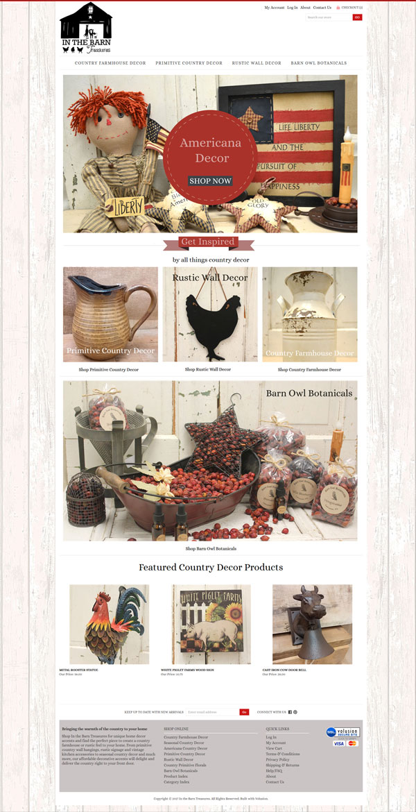
Here is the home page of their new site

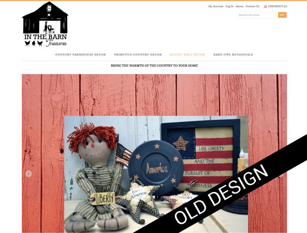
and before we dig into what I did lets take a quick look at the before

before in the barn treasures

Clearly there is a huge visual improvement but this project was not all about producing a better looking site.  We wanted to address a number of issue

Search Engine Optimization

We started with extensive of behind the scenes work addressing search engine optimization. The site is built on Volusion but was using none of it’s built in SEO tools. After a market analysis we pulled together a list of keywords and got to work enriching the site, renaming page file names, image names, and generally working in our key words wherever appropriate. Every single product in their catalog was optimized.

Visitor Engagement

Getting a user to do what you want them to do once they reach a site is a skill. First of all you need those few vital few seconds to convince them this is a site worth looking at, so a professional enticing look and feel is a must. Then “Call to Actions” come into play. We completely reworked the content of the home page, removing a slideshow that really achieved very little in terms of usability and replacing it with distinct call to actions which directs users to the newly reworked product categories

The objective here is to give a user quick visual prompts and not make them think too much!

We also added a featured product section which is dynamically driven.

We continued improving user engagement on the category homes.The original site had tiny photographs which hardly enticed the user to click further. There was also a “landscape/portrait” mismatch.

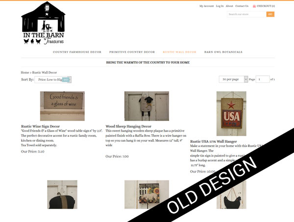
We gave each category a simple graphic banner, a title..great for SEO and a brief introductory paragraph. Then working from the original raw product photograph we adjusted them for better exposure, resized them so all the photographs were now identical in size, gave the each a keyword rich name and uploaded everything again. The result, a much more appealing category home page with photographs that are big enough to entice further clicks.

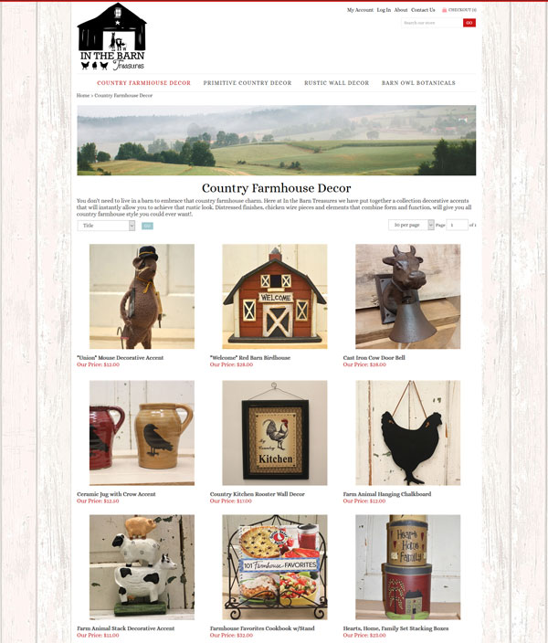
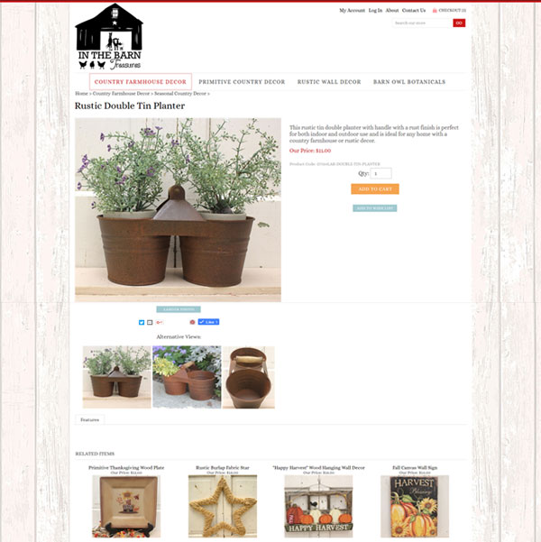
The product pages were also enhanced with much larger photos and keyword friendly descriptions of each piece.

in the barn treasures country decor product

Internet Marketing

Once the site was in ship shape condition from a usability and SEO standpoint it was time to re-launch it to the world. It has been submitted to all the big players (and lots of little players) in the search engine world and all the products uploaded to Google Shopping

We also created a number of social media profiles including Pinterest, Facebook, Scoop.it, Fancy, and  Wanelo

Check out the site at https://www.inthebarntreasures.com and browse through their catalog of wonderful country home decor products!

New Website for Motor Appliance Corporation

We have been working with Motor Appliance Corporation for many years… mostly on the graphic design of technical products flyers and precision design of overlay stickers for their products.

The re-design of their website was a project that had been on the back-burner for some time but just last week we launched a brand new shiny site for them. Visit it at macmc.com

macmc responsice website

Web re-design projects are always really satisfying particularly when you take a look back. Here is the original site. It had served them well for many years but was looking rather dated and wasn’t working well on mobile devices

website redesign

The new website was built on the WordPress platform which will give the client much more freedom to self maintain. We offer full training on using WordPress in the form of screenshot videos in which we walk through a specific task. This approach works really well as they can be viewed and revisited as many times as as required.

The site itself is very clean, with power pops of red in keeping with the branding elements and is fully responsive.

The Power of Before and After Photographs

We are all suckers for before and after transformations no matter what the subject.

Why?

Because before and after photographs engage. They grab attention offering potential and possibility and show us what can be done

Take a look at these before and after photos

Cheap > Expensive

cheap-expensive

Amateur > Professional

Drab > Fab

before after tattoo wipe

Trash > Treasure

before-trash
after-treasure

Without one word of copy we have told a story in each set of photos – so important in the micro attention span of today’s website users. We have offered a level of engagement to someone who has an outdated website and maybe looking for a re-design, someone who has a faded tattoo and even someone looking to create a piece of art from trash. Granted it is an odd mix to have on a single page but you get the picture.

Advantages

This engagement factor can lead to

  • A better understanding of a product which in turn can improve sales conversions
  • Impart a level of expertise
  • An improved connection with your visitors
  • The increased possibility of your content being shared on social media and all the upsides associated with that – increased traffic, better organic search engine placement, more quality back links etc.
  • Repeat visits to a website – visitors experiencing good interesting content on a site are more likely to return to it in the future

No matter what type of business you are in, before and after photographs are an excellent addition to your marketing efforts.

Including Before and After Photos in Your Marketing Mix

For products or services that result in a visual change – think web design, interior design, weight loss, fashion, makeup … the before and after photos are obvious – a screenshot of a website before and after re-design, a face with and without makeup, a sofa with and without pillows.

But say your business or service offers no real visual elements. How can before and after photos help and how do you go about creating them?

Here you can create scenarios which represent a situation with and without your product or service comparing Good (with service/product) vs Bad (without).

For example your are accountant who specializes in working with small businesses- how about a photograph of a shoe box messily filled with old receipts and invoices with the business owner pulling their hair out and another photo showing a neatly organized ledger and completed tax return with the business owner with a well groomed hair-do. A little creative thought can go a long way in dreaming up good before and after scenarios.