If you are a website designer or an owner of a web site that offers advertising this post is for you.
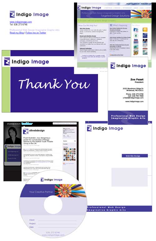
Yesterday I revealed a branding project I have been working on which included the creation of a logo, business card, website and banner ads. An important part of the website was that it be able to accommodate banner ads as this was to be a major source of revenue for the site.
To refresh your memory here it is again
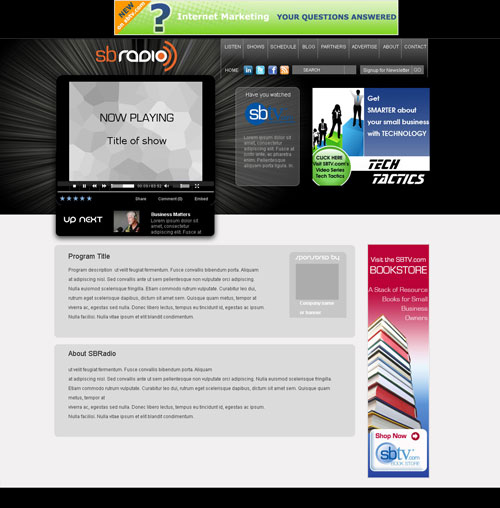
Designing a web site with ads in mind poses a challenge. You need a site with conflicting call to actions.
Call to action A
Engaging your site visitors with your site’s content – happy surfer and web site owner
Call to action B
Encouraging your site visitor to leave your site by clicking on a banner ad – happy advertiser
So how do you design a website to please both surfer and advertiser? Successfully accommodating banner ads into a web site is all about balance between space, size, color and movement.
Space and Size
There are industry standards for the size and shape of Ad units suggested by Interactive Advertising Bureau (IAB). This list of acceptable shapes and sizes is growing each year but to create a website to accommodate all is not wise. A better approach is to pick a few of the best performing sizes/shape (do a search to see the current hot list) and create your website design around those blocks.
The thoughts of ads on a page can sometime conjure up an image of clutter and disarray but careful spacing and positioning of the units can optimize the performance (click through) of the ad, while minimizing the invasive effect they have on the surfer.
Color
The banner ads provided by the advertisers are likely to be multi colored and certainly not designed to compliment a web site with a complicated color scheme. The best approach is to keep the color scheme of your site monochromatic, in the case of the SBradio site we selected tones of gray. This approach helps the ads pop, happy advertiser, but enables the site visitor to easily switch focus to the site content, happy surfer.
Movement
Many banner ads have an element of movement, either a flash animation or a rotating gif. To overcome the competing effect of an animated element it is best to ensure the host web site has no or little movement itself.
So ads vs content, let the competition begin!
2010 © St Louis Web Designer


