Rebranding for The Chicago Web Designer

It was time.

Our previous brand image has served us well but we have been wanting to shake things up and redesign it for over a year now. Finding time has been difficult but we have finally rolled out a new brand image for The Chicago Web Designer, Indigo Image.

Lets start at the beginning with the first thing we tackled … an update of our logo.

Logo Redesign

Chicago web designer logo

We have dropped our rectangular icon replacing it with a circle but the “pathway” shape remains the same, the color indigo is now complimented with a fresh blue. We also updated the typeface to a less boxy font. While the logo is not a million miles away from where we started it is definitely fresher. The circular icon is nicely compatible with the size and shape restrictions for many social media profile icons ( see what we mean by checking out our Google + page)

Website Re-design

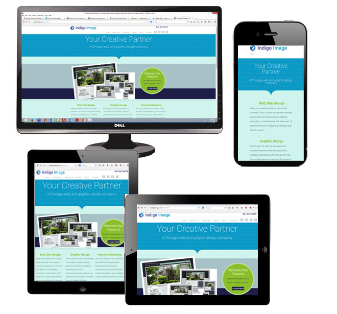
One of the main drivers behind the redesign of our website is the fact there has been a huge surge in traffic from mobile devices such as tablets and smart phones. The growth is so massive it is actually predicted  web traffic from these devices is set to pass traffic from desktop computers this summer. While we had coded our previous design to react responsively ( see this blog post), time constraints meant that we didn’t redesign …just recoded. It was a good stop gap but needed fixing!

Both the design and the code has now been optimized for viewing on any device.

responsive design chicago web designer

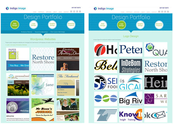
The re design gave us the opportunity for some content re-organization. The main area we reworked was the portfolio section. It is now split into four categories

We used chunky tiles to navigate portfolio items and finger friendly navigation buttons to switch between portfolio galleries.

chicago web designer portfolio

Social Media

Our re-branding has been carried through to our social media profiles

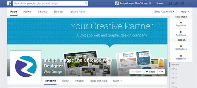
Here is our Facebook page

facebook branding

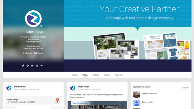
and our Goggle + page

Google plus branding

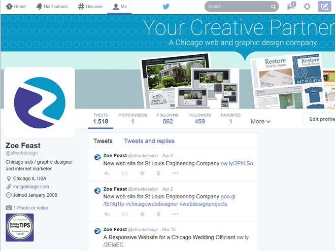
and a new look for our Twitter profile

Twitter branding

New web site for St Louis Engineering Company

Launched today is a brand new web site for St Louis engineering company, Zagros Engineering.

zagros engineering website

The site presents their company information and services though a clean design with easy to use navigation.  The Zagros .net developers will be adding future .net functionality to the site.

We first worked with Zagros on a redesign project for a shopping cart site  Zagros Robotics and are delighted for the opportunity to work with them again.

Redesigned Website for Paper Shower

We have  work with businesses all over the country on web and graphic design projects, but it is especially rewarding working with  businesses based in our local vicinity.  Our newest client, Paper Shower, is located right here in Lincolnshire IL .

Launched yesterday was a redesigned version of their web site papershower.com

paper shower body wipes web site redesign

Paper Shower offers a range of unique body wipes which combine a large wet wipe with a dry towelette and are great for active people who are looking to freshen up on the go – bikers, runners, while camping, hiking and traveling  or even on the golf course.

Why Redesign?

website redesign lincolnshire ilThere are several reasons for the need to redesign a web site and the old Paper Shower site fulfilled quite a few.

Firstly the site was making the visitors work too hard to understand the product, it was only after clicking through from the home page that the concept of the product having both a wet and dry towelette became obvious.

Secondly, almost no consideration had been made as to who the product was being marketed towards – it was too generic.

Lastly the site was not at all optimized for the search engines, the home page itself was a collection of images and as a whole had very little keyword rich copy.  Ranking in the search engines was poor and  traffic was minimal despite  great PR coverage the product has had over the last few years.


Our Web Re-Design Approach

Understanding the issues facing the old site helped us create a strategy for the  re-design and re-launch of the new site.

Competitive Analysis

Any SEO project needs to kick off with a through understanding of  the online competition. We took an in depth  look at other body wipe websites and our analysis  resulted in the compilation a list of favorable key phrases.

Web Content
We wanted to address several things with the web content

  • Communicate the uniqueness of the product in a simple format that did not require the user any effort
  • Engage with the target market of outdoorsy / active people
  • Add more call to actions to purchase product
  • Enrich it with target key words and phrase for SEO benefits

We started with the creation of a set of web banners that incorporated the product and an outdoor scenario or an occasion where the product would be useful. Each banner also carried the phrase Wash > Dry > Done, which was elaborated on with keyword rich copy underneath which quickly and easily explained the product.

paper shower body wipes golf
paper shower body wipes camping
paper shower body wipes travel
paper shower body wipes hiker
paper shower body wipes gym

The home page was updated to include more details of the product range and examples of who may find the product useful. We used video and client testimonials throughout the site for easily digestible communication.

For better engagement with the target audience we created a set of landing pages

and also added a blog

We are in the process of completing the internet marketing of the site but are confident that the  re design and optimization will result in increased traffic and sales.

Read more about Paper Shower in our web design portfolio.

© 2013 Chicago web designer

New Website for Heinzen Smith Properties

Client Margaret Smith, of  Heinzen Smith Properties, has a 150 year family history of building homes just north of Chicago. Each house is custom designed and blends beautifully with existing homes in the Wilmette area.

Margaret contacted us with lots of ideas for her web site and we have been able to translate those ideas into a site that perfectly captures what she wanted to achieve.

Home builder wilmette IL Chicago

After developing a color palette inspired by a slate roof with weathered copper gutters, we designed a home page which gives site visitor a quick glimpse of some of their most eye catching homes and focuses attention to New Homes for Sale.  We were spoiled for choice when it came time to select  photographs as the client provided so many stunning homes to pick from. Not wanting waste an opportunity to showcase them further, we carried them through to the inner pages of the site and cropped them to center on doors as a “welcoming” gesture.

chicago home builder website

The site was also designed and coded as one that is fully responsive – see here for an explanation of responsive web design

Here it is on a desktop

responsive web design chicago
On an ipad in portrait and landscape orientations
reponsive web design chicago
And finally an iphone
responsive web design chicago

You can visit the site at heinzensmith.com

Freshening up a WordPress Website for a Chicago Health and Wellness Consultant

We are currently working with Janet Summerfelt, an independent Reliv Distributor here in Chicago, in the freshen up of her WordPress website.

In our kickoff meeting she came well prepared, having not only found a stock image she wanted to incorporate in a new header but also ideas for a color palette. While some clients need our complete creative input, others like Janet have a firm idea of exactly how they want their site to look and only require us to execute their ideas. We are happy to work either way.

With a few image changes and CSS tweaks we were able to give her WordPress web site a much cleaner fresher look  much more in keeping with the nutritional supplements she promotes
Chicago wordpress template updated

This is the original look of the site. It is amazing what a few color and image updates can do.

Chicago wordpress template update

Visit Janet at janetsummerfelt.com

Chicago Web Design Company and Responsive Web Design

We have been offering Responsive Web Design services for quite a while now, so we really should take a rap on the knuckles for the fact that our own website did not behave responsively.

That is until now.

Client work always takes precedent over any other work, so that is our excuse for the tardy conversion of our site to a fully responsive website.

Our site is a great showcase of how an existing web design can be converted so that it behaves responsively – optimizing the users experience no matter what they are using to view the site, desktop, laptop, tablet or smart phone. We made no changes to the design or look and feel of the site but all the work was done on the code which powers the site – under the hood so to speak.

This is how it looks on a desk top,

responsive web design Chicago indigo image
here it is on a tablet,
responsive web design on ipad


and here it is viewed on a smart phone

responsive design on an uphone

You can experience this yourself just by re-sizing your browser window ( Firefox and Chrome work well for this).

Looking to convert your website into one that is responsive?

This type of coding conversion can be readily achieved on most websites. If you are looking to convert your web site into a responsive web site we offer a free review service. Contact us today or call 847 607 8679 to get started.

Re-designing a Website: 5 Things to Consider

There comes a time in the life of every web site when a re-design is in order. This can be driven by a new brand image,  making better use of advancing web technologies or simply the need to provide a better organizational structure.

Needing to re-organize was the driving force behind a design shake up of Creative in Chicago, a craft and home decor blog and the outlet for my personal creative endeavors.

When I first started this blog  I opted for a quick and easy Blogger template,  simply adding a custom header and working with the template designer to add a unique background and set the blog layout.  It was fully functional but not the most appealing site in the world, but as I had no idea if it was something I was going to write on a regular basis, I didn’t want to invest a load of time in setting it up.

Creative in Chicago

As it turns out the blog now has over 200 posts with over 30K visitor a month and was in dire need of a shake up, so it underwent a redesign . For regular blogging I generally recommend using WordPress but because I did not want to spend more time than necessary, I decided to stick with Blogger.

redesign website

During the redesign process I wanted to address

    1. Look and Feel
      The overall look and feel of the blog was very bland and I wanted to punch it up a notch but still let the content of the site do most of the talking.
    2. Reorganization/Navigation
      The posts in the blog had all been categorized but I wanted to refine the categorization process and then use it as a navigational structure, making posts and topics of interest much easier to find.
    3. Readability
      To enable visitor to quickly scan new content from the home page or a category page I wanted to move from the full post to a summary post format.
    4. Advertising
      The site receives around 30K visitors a month and I wanted to explore the advertising opportunities available for generate revenue from the site.
    5. Responsive Design
      Around 20% of the traffic comes via mobile devices so it was important that I provided a site that was optimized for those visitors.


Look/Feel and Readability

In re-designing a site I wanted to keep some semblance of the original site so not to completely alienate my readers with something totally new and unexpected.  I kept the background patterns and type face of  “Creative in Chicago” the same but completely reworked  the header, creating a little more pop with the use of color and simple design elements and also integrated social media icons and RSS feed subscription.

I also moved away from the full post format on the home and category pages. Instead the reader is now offered a summary of each post with an thumbnail picture. It is much easier to see at a glance the content of the site.

creative in chicago blog

Reorganization/Navigation

Although I had been using  categories to define content there lacked a definite structure which I could use as navigational tool.  I reassessed and ended up with five main categories : Art – Crafts projects – Decorating – Free Stuff – Garden projects and within these categories I defined a number of sub categories. For example the category Decorating has five sub categories: Before and Afters – Painting – Decorative Accents – Wall Art Ideas- Windows .  The navigation bar was reworked to include these main blog categories, with  drop down elements for the subcategories. A search bar  was also prominently placed.  Posts that were buried deep within the blog are now much more accessible.


creative in chicago website navigation

Advertising

I decided to incorporate Google Adsense into the site and allotted a spot high on the sidebar for placement.  I wanted a position that would work both well for click throughs but not to be too invasive for my readers.  I am also experimenting with in-line advertising through infolink. Both are working nicely!

Responsive Design

Fortunately Blogger makes this really easy and it is as simple as selecting a pre-made template to display when anyone accesses the site with a mobile device.

In Progress: Website for Chicago Home Builder

Here is a sneaky look at a new web site we are working on for a Chicago custom home builder.

The client has provided an abundance of photos and we have been spoiled for choice when it comes to selecting which ones to use. During the defining stage of the project we discussed color palettes and the idea of taking inspiration from a slate roof with copper gutter was born.
New website for Chicago builder

The project is in development stage of our process and should be live in a few weeks.

Web Site re-design for Chicago Suburbs Business: AED Battery Exchange

Launch today is a freshly re-designed website for AED Battery Exchange aedbatteryexchange.com. Located in the far north suburbs of Chicago, they are leading the way in re- celling batteries for Automated external defibrillators and wanted a web site which truly matched their innovative product.

Also on their want list was a professional looking site which was easy to navigate and appealing to their target audience.

We created a very clean look and feel, the home page featuring an eye catching Call to Action banner to “Find your AED battery”.
AED battery exchange

They batteries were categorized in terms on manufacturer and featured images which can be enlarged so the user can clarify the correct battery.
aed website chicago

The site is definitely a step up from their old one

aed battery website chicago