Emotions of a Type Face: A set of energetic fonts

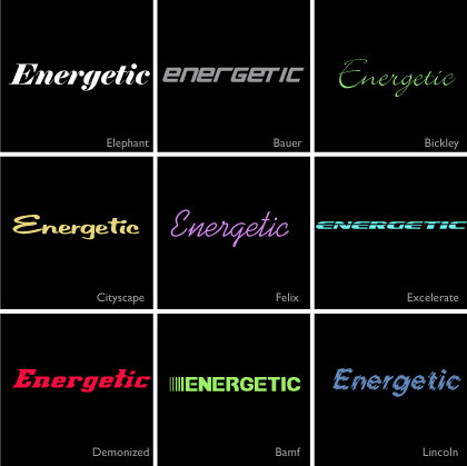
Here is the next installment in my series “The emotions of a typeface”. Today’s set features energetic fonts.

They all convey a sense of movement, get-up-and-go, pep,  animation, activity, liveliness and zing

energetic fonts

Think “boot camp” – any one of these would work for branding elements.

Next time I’ll showcase a set of dreamy fonts. View the first in the series “playful fonts

2010 © St Louis Web Designer
Emotions of a Type Face: A set of playful fonts

Ask any web or graphic designer how many type faces they have loaded in their font directory and you will be boggled by the number, they are important tools of the trade and we like to have lots!

Selecting the right typeface for a project, title, button, logo, banner, call to action, etc, can be a time consuming task. What sort of emotion will the typeface evoke and will it be the right emotion?

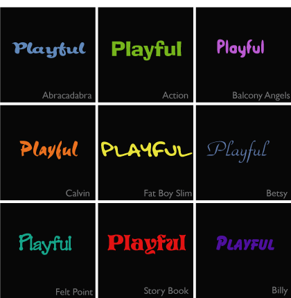
Today I am starting a new series, the emotions of a type face, and to kick it off lets start with a set of playful fonts.

These fonts all convey a relaxed, laid back emotion. They are fun, non confrontational but functional.

playful fonts

Next time I’ll showcase a set of energetic fonts

2010 © St Louis Web Designer

Eye of a St Louis web designer: Call to action

As a web or graphic designer one of our jobs is to create design elements that result in an action by the viewer. Whether it is a button to click on, a web site to visit (think banner ads) or creating an interface which is easy and intuitive to use we are constantly thinking about the “call to action” of our designs.

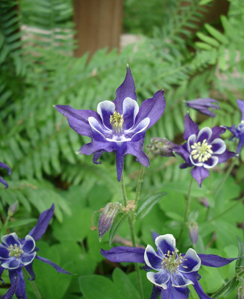
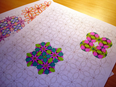
Nature does a fabulous job at this. Take a look at these beautiful purple flowers (anyone know what they are?) blooming in my garden. A flowers job or “call to action” is to entice insects to visit so they can cross pollinate.  They do this using color, contrast, shape and scent to direct the insects to where it’s all happening the in center of the flower. We don’t yet have scratch and sniff monitors so scent is not one of the tools us web designers can use. Maybe it will be an internet technology of the future!
call to action in nature

2010 © St Louis Web Designer

Can you see bluish yellow or reddish green?

While at the airport on my way to Chicago last weekend I picked up the Feb issue of Scientific America. It’s always a good read and I was particularly intrigued by an article on impossible colors, colors that we are not supposed to see. Can you imagine a reddish green (greenish red) or yellowish blue (bluish yellow).

You can read about the theory here but cut to the chase and do these simple tests below to see the colors for yourself.
Instructions

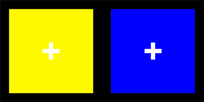
  1. Click on each of the graphics below, this will bring up a much larger image in a new browser.
  2. Hold a finger in front of your nose and focus intently on it. This will cross your eyes.
  3. Slowly remove your finger from view
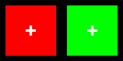
  4. On your screen you will see three boxes. The middle box will show the impossible color, a bluish yellow or a reddish green. Make sure the crosses line up.

Can you see yellowish blue?

bluish yellow

Can you see reddish green ?

reddish green

It took me a while to master the visualization technique but it is a bit like doing the magic eye pictures. The key to seeing the colors is to hold the cross steady. They are pretty unstable and seem to flick in and out but they are definitely colors I have never seen before.

How about you, can you see them?

2010 © St Louis Web Designer

How to work with your web designer during the design phase of a project

Last week I talked about How to Hire a Web Designer , today lets tackle what to expect and how to work with your web site designer during the design phase of a project.


What to expect

  • Your designer will create a look and feel of key pages of the site and you will be presented with jpegs of these pages. Nothing will be “clickable” at this stage.
  • The site will most likely be populated with Lorem Ipsum. This is because the designer needs you to concentrate on the graphical elements and layout of the site and not get bogged down in copy.
  • The design phase is a very collaborative phase, expect a few rendition of a design based on feedback you give.
  • You will be given a time frame in which to critique. Imperative to keep your project delivery date on target.

How to Evaluate

  • How do you feel about the overall look and feel?
  • Does the color palette work for you?
  • How about the white space?
  • Are there intuitive navigational elements
  • Are there obvious call to actions?
  • To what element of the design is your eye drawn?

Giving Feedback

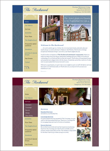
Don’t be afraid to be brutally honest in your feedback. If the design is not working for you on any level it is much better to be upfront. However a simple “I don’t like it” is no help. Your designer needs to understand what it is about the design that is “not floating your boat” and will help guide your evaluation process to fix on the elements that need to be addressed. For example, imagine you have a real aversion to the color purple and the inclusion of a purple element is causing “tunnel vision” Sometime just tweaking the color palette of a design can have the effect of ” I don’t like it” to “I love it”.

In short being able to articulate  your likes and dislikes will ensure you end up with a design you absolutely love.

Signing Off

Once your designer produces the “winning” design” you will be asked to sign off on the design. Making drastic design changes after this point can effect the coding efforts during the next stage of the project and typically incur additional costs.

2010 © St Louis Web Designer
Color palettes and web design

Last week I talked about  how color can be used in website design.

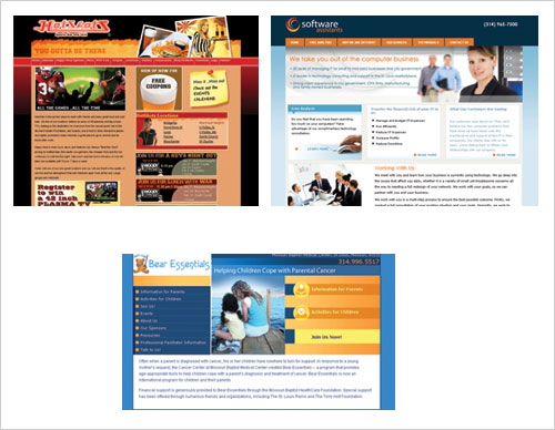
Quick pop quiz. What do the follow three web sites have in common?

The answer is ORANGE

Does the use of orange in these designs conjure up the same emotions or associations?  Lets take a look at a breakdown of their color palettes.


The color palette used in this site results in a cozy and friendly feeling. The use of orange here really adds warmth.


Teaming orange with cool blues produces an invigorating pop which not only helps guide the eye but also adds an element of energy.

Here again orange has been teamed with blue but in this case the use of yellow and orange adds a sense of friendliness and approachability.

So three designs and three different emotions, warm and friendly, invigorating and approachable.

2010 © St Louis Web Designer
The uses of color in web design

Color is one of the most important tools in a web designers tool box. It happens to be one of my favorite.

The uses of Color: Define: Engage : Differentiate

Color can can be used to define, think of brands like T Mobile (they have a trademark for Magenta) , UPS ( What can brown do for you) and our very own Indigo Image.

color_logos

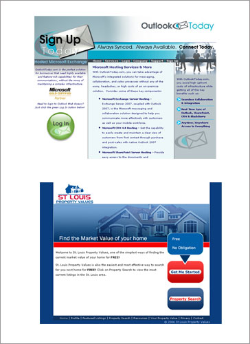
It can be used to engage – look at these example of call to action elements.

And can be used to differentiate, look how the use of color on this web site is tied into the navigation.

Colors are also associated with different emotions and meanings but interestingly these emotions can change depending on the palette in which they are used.

Stay tuned for more about color palettes next time.

2010 © St Louis Web Designer