There comes a time in the life of every web site when a re-design is in order. This can be driven by a new brand image, making better use of advancing web technologies or simply the need to provide a better organizational structure.
Needing to re-organize was the driving force behind a design shake up of Creative in Chicago, a craft and home decor blog and the outlet for my personal creative endeavors.
When I first started this blog I opted for a quick and easy Blogger template, simply adding a custom header and working with the template designer to add a unique background and set the blog layout. It was fully functional but not the most appealing site in the world, but as I had no idea if it was something I was going to write on a regular basis, I didn’t want to invest a load of time in setting it up.

As it turns out the blog now has over 200 posts with over 30K visitor a month and was in dire need of a shake up, so it underwent a redesign . For regular blogging I generally recommend using WordPress but because I did not want to spend more time than necessary, I decided to stick with Blogger.
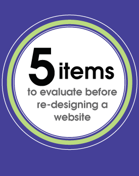
During the redesign process I wanted to address
- Look and Feel
The overall look and feel of the blog was very bland and I wanted to punch it up a notch but still let the content of the site do most of the talking.
- Reorganization/Navigation
The posts in the blog had all been categorized but I wanted to refine the categorization process and then use it as a navigational structure, making posts and topics of interest much easier to find.
- Readability
To enable visitor to quickly scan new content from the home page or a category page I wanted to move from the full post to a summary post format.
- Advertising
The site receives around 30K visitors a month and I wanted to explore the advertising opportunities available for generate revenue from the site.
- Responsive Design
Around 20% of the traffic comes via mobile devices so it was important that I provided a site that was optimized for those visitors.
Look/Feel and Readability
In re-designing a site I wanted to keep some semblance of the original site so not to completely alienate my readers with something totally new and unexpected. I kept the background patterns and type face of “Creative in Chicago” the same but completely reworked the header, creating a little more pop with the use of color and simple design elements and also integrated social media icons and RSS feed subscription.
I also moved away from the full post format on the home and category pages. Instead the reader is now offered a summary of each post with an thumbnail picture. It is much easier to see at a glance the content of the site.

Reorganization/Navigation
Although I had been using categories to define content there lacked a definite structure which I could use as navigational tool. I reassessed and ended up with five main categories : Art – Crafts projects – Decorating – Free Stuff – Garden projects and within these categories I defined a number of sub categories. For example the category Decorating has five sub categories: Before and Afters – Painting – Decorative Accents – Wall Art Ideas- Windows . The navigation bar was reworked to include these main blog categories, with drop down elements for the subcategories. A search bar was also prominently placed. Posts that were buried deep within the blog are now much more accessible.

Advertising
I decided to incorporate Google Adsense into the site and allotted a spot high on the sidebar for placement. I wanted a position that would work both well for click throughs but not to be too invasive for my readers. I am also experimenting with in-line advertising through infolink. Both are working nicely!
Responsive Design
Fortunately Blogger makes this really easy and it is as simple as selecting a pre-made template to display when anyone accesses the site with a mobile device.