


Over a third of all traffic for most websites now comes from mobile (smartphones) or tablet devices. This is a trend that is rapidly growing and is here to stay.
So how does this affect the small business owner?
If your website fails to give your site visitors an optimal experience when they are accessing it via a mobile device, then you are potentially sabotaging the marketing goal of your website, be it leads, sales or information sharing. If your website responds to the device being used to view it your site visitors will have a much better engagement and the site is much more likely to achieve its marketing goals.
A website that adjusts to devices is the essence behind responsive web design.
Responsive Web Design in Action
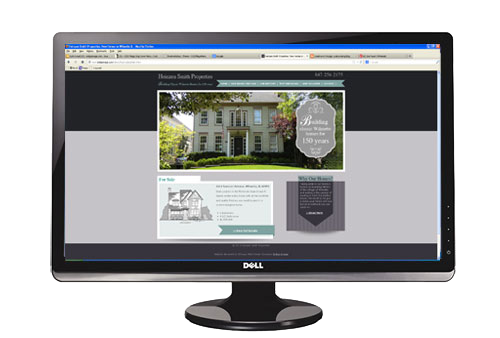
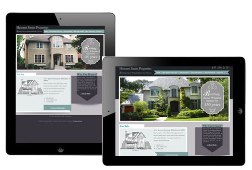
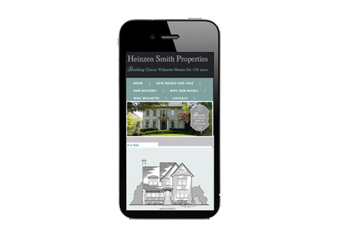
This website we designed for Heinzen Properties behaves responsively.
Here it is on a desktop monitor.
and on an iPad, in landscape and portrait modes
and finally on an iPhone
You can also see how the site responds by re-sizing your browser. The design elements of the site will resize and change positions as the browser size is changed.
