


We have recently re-designed the menu for St Louis restaurant and pub, Hannegans.
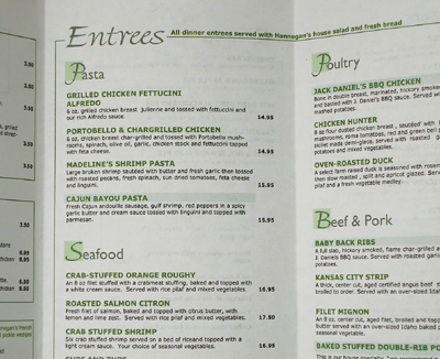
We produced menus for their Lunch and Dinner and take-out offering and were constantly hungry during the process!
We have recently re-designed the menu for St Louis restaurant and pub, Hannegans.
We produced menus for their Lunch and Dinner and take-out offering and were constantly hungry during the process!
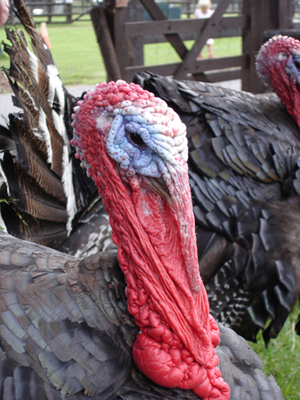
Thanksgiving is upon us and today millions of these delightful birds will be consumed.
This stunning example will be spared however as it lives in England!
We recently completed the design for a classroom logo for Rockwood school district’s Center of Creative Learning.
The logo for a 5th grade Biotechnology unit will feature on a class room banner.

St Louis based Integravity “Turns today’s ideas into tomorrows reality”. We are assisting them with their mission by designing a custom new web site ..look for it’s launch in 2006. In the mean time we have created a custom holding page to deliver contact details.
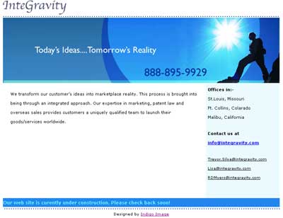
visit them at www.integravity.com
For a week that features food in a big way it is rather fitting that our latest project is the creation of a menu for a downtown St Louis restaurant, Hannegans.
Watch this space for it’s release.
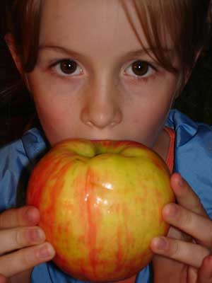
Tis the season for all things big. Look at the size of this apple!
The usability of a web site is one of my pet subjects ..the navigation has to be intuative, the content has to be delivered in a logical user friendly way and a site has to load quickly …just a few of the issues thyat affect the usability of a site.
Another is the readabilty of the content. Compare the following 2 paragraphs …which is the more readable?
Using a dark background with light text can be an effective way of drawing the users attention to an area and in the example above this is the case. However defining a whole web site to have a dark background and light text can be very tiring on the eyes and make the content difficult to read.
It is also important to have adequate contrast between the the text and background.
As a web/ graphic designer one of the best compliments I get from a clients come in the form of referrals.
Simply put if a client is not 100% happy with my creations and service they will not risk their repulation by referring their clients to Indigo Image!
As a graphic/web designer, resolution for me is defined as dpi or dots per inch.
The medium used to publish detemines what resolution used to design in. For web it is typically 72 dpi while for print it is 300dpi.
This huge difference in resolution means that what is created for the web can’t be magically turned into a beautiful 300 dpi image ready for print .. and what happens if you try? You end up with a jagged, dotty, blurry print.
We have recently launched a new web site for a St Louis Wedding coordinator, Sarah Grus. Sarah wanted a high end, elegant web site to feature her wedding planning services.
” I think the site looks fabulous!!!”
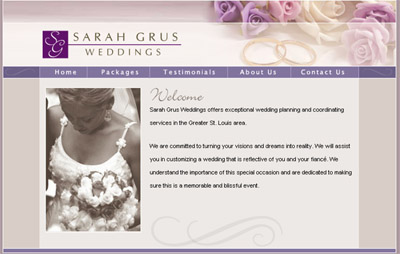
Visit the site at www.sarahgrusweddings.com