Food Photographers Website

The last few weeks I have been working on a new website for a A-Yo Kitchen, a York PA recipe developer and food photographer. This startup business is the brain child of Alysha Yoder, who has such talent when it comes to preparing, styling and photographing food. I was literally slobbering as each photograph got uploaded to my dropbox.

Alysha wanted a very minimalist look to her web site, where her photographs have the staring role. She had actually picked out a WordPress template before we connected and had dabbled with it on WordPress.com. However as with a lot of templates and the limitations faced when running a website though WordPress.com, she was unable to make it do exactly she wanted to achieve her vision. It needed the magic touch from a professional web designer!

The first thing I did was to get it off WordPress.com and set it up as a self hosted site. If you need multiple plugins and are after a particular functionality it is actually more cost effective to take this route.

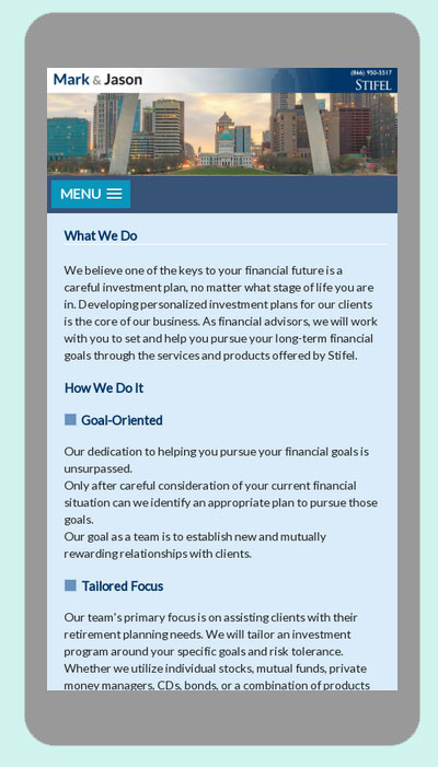
Working from Alysha’s sketches,

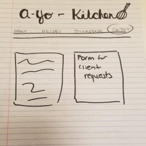
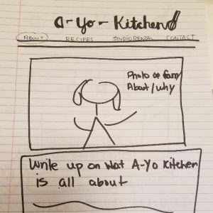
I brought the site to life. It is actually really useful when a client can provide sketches as it really helps clarify exactly what they are after.

ayokitchen website

ayokitchen

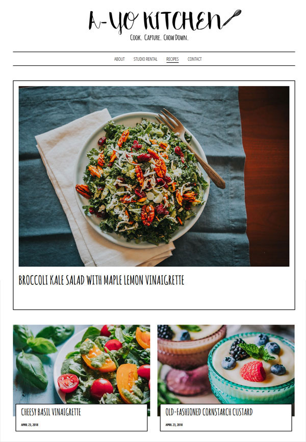
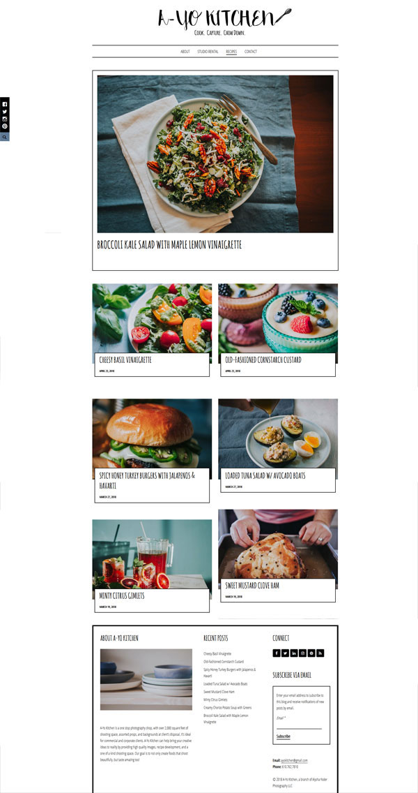
Take a look at it at ayokitchen.com, it will have you slobbering too!

Re-Coding a Site to be Mobile Friendly

Having an outdated website can harm your business and potentially drive clients away, particularly if they are using a mobile device to visit a site that is not mobile friendly. Why go to all the effort of trying to read tiny text or battling with horizontal scroll bars when maybe your competitors offer a flawless mobile experience. Search engines like Google will always give preference to sites that are mobile friendly over those that are not, so search engines rankings and equity are also affected.

Many small business owners think that making a website mobile friendly requires a complete redesign and are put off by the costs of doing so. However with a careful “under the hood” re-code the look and feel of a site can often remain intact, with the coding giving it the functionality to respond to whatever device is being used to view it.

This is exactly the approach we took to updating the website for a Whytegate Farms, a Chicago based  supplier of environmentally friendly cleaning supplies. They were perfectly happy with the look and feel of the site but were looking to make it mobile friendly

Here is the site before

not mobile freindly website

Not mobile friendly – desktop view

Not mobile friendly – Mobile view with horizontal scroll bars

And here is the site after it was re coded so that is responds to what ever device being used to view it.

Mobile Friendly Website- Desktop and Mobile View

We had to make a few minor design tweaks but overall the look and feel of the site when viewed on a desk top or laptop is the same.

Before and After St Louis Financial Advisor Web Site

Hands up if you like looking at before and after projects? Me!

Here is a mini redesign project I did for St Louis financial advisors, Mark and Jason. The site before

and after

I added a new logo, tweaked the colors, reworked the header and used a more modern font for the copy.

The result a much cleaner and inviting site… mobile friendly too!