New website for Heartstation.com

I have said it before but I will say it again, web redesign projects are so satisfying. It’s something about breathing new life into the old and worn, giving it shape, presence and function to do battle in today’s business environment.

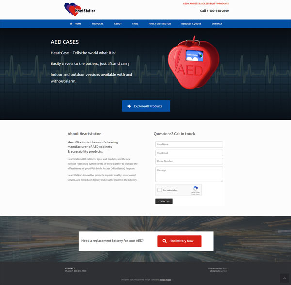
I have been working with Heartstation, providers of AED cabinets, for some time now and was delighted when they hired me to revamp their website which dated back to 2006! The internet technology available since that time has come a long way.

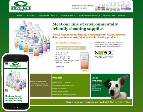
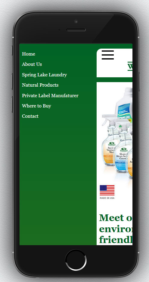
The redesigned site encompasses a bright,open look and feel with call to actions throughout. It offers a completely responsive experience for the user whether they are visiting from their mobile or a desktop.

Take a look https://www.heartstation.com

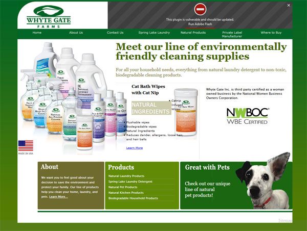
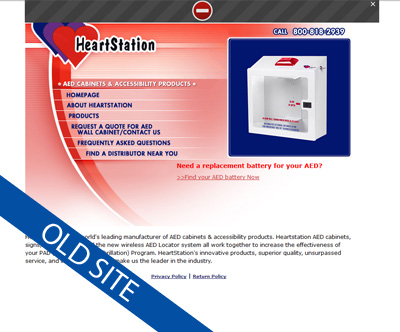
and here is a little reminder of their previous site

Are you a small business looking to redesign your website?
Call us at 636 795 7988
or email us

Re-Coding a Site to be Mobile Friendly

Having an outdated website can harm your business and potentially drive clients away, particularly if they are using a mobile device to visit a site that is not mobile friendly. Why go to all the effort of trying to read tiny text or battling with horizontal scroll bars when maybe your competitors offer a flawless mobile experience. Search engines like Google will always give preference to sites that are mobile friendly over those that are not, so search engines rankings and equity are also affected.

Many small business owners think that making a website mobile friendly requires a complete redesign and are put off by the costs of doing so. However with a careful “under the hood” re-code the look and feel of a site can often remain intact, with the coding giving it the functionality to respond to whatever device is being used to view it.

This is exactly the approach we took to updating the website for a Whytegate Farms, a Chicago based  supplier of environmentally friendly cleaning supplies. They were perfectly happy with the look and feel of the site but were looking to make it mobile friendly

Here is the site before

not mobile freindly website

Not mobile friendly – desktop view

Not mobile friendly – Mobile view with horizontal scroll bars

And here is the site after it was re coded so that is responds to what ever device being used to view it.

Mobile Friendly Website- Desktop and Mobile View

We had to make a few minor design tweaks but overall the look and feel of the site when viewed on a desk top or laptop is the same.

New Web site for Burns Recovered

Launched this week is a brand new look for the Burns Recovered website
burns recovered non profit website

I have been working, pro bono, for this not for profit organization for the last six years. In that time I have help them move with the times, updating a very dated website and then making the web site responsive and even integrating a new logo.

This latest update was driven by the old website becoming very cluttered as it had become updated. The new look offers a much cleaner simpler look and features the stunning photographs from the book published by Burns Recovered “Beauty Is…” The site offers very clear call to actions and performs beautifully across all devices.

Here is what Lynn Heulsmann, Executive Director of Burns Recovered had to say

“Indigo Image created a dynamic, professional and engaging website for Burns Recovered/Midwest Children’s Burn Camp.  In addition to the site being desktop and mobile accessible, it is aesthetically pleasing  and we are thrilled with the outcome.”

New Website for Chicago Headhunting Company

We have worked with Peter Meder & Company, a Chicago executive headhunting company, for over six years now. The original site we created had served them well, but was created before the popularity of smartphones … as a result it did not offer site visitors an optimum “mobile experience”.

The new site, launched today, gives the company a brand new look which is more up to date and visitors can now have a good experience from whatever device they are using to access the site, desktop to phone. Check it out at http://pmedercompany.com/

new website for chicago headhunter

new website for chicago headhunter

New Website offering Online Interior Design Service

Launched today is a new website, Interior Designs 2GO – an online interior design service. The site is the brain child of HGTV kitchen Crashers designer, Suzanne Falk.

online interior design service chicago

Users need only measure and photograph their space, answer a room specific questionnaire. A professional designer will interpret it all and create a new custom look for their room.

online-interior-design-service-website-chicago-2

online interior design service chicago

The design of the site was kept clean and simple and the process of purchasing the service, short and sweet.

The site was built on the WordPress platform and is mobile friendly.

Updated website for St Louis Author

I am honored that so many of my clients come back to me for repeat work, even moving from St Louis to Chicago 5 years ago ,did not destroy the relationships I have built up.

I have been working with Cynthia Reeg, a St Louis Children’s author, since 2007 and was delighted recently see an announcement that she had got a new book deal for a trilogy. It had been a while since her website had been updated and she contacted me looking to take her site to the next level. She wanted to not only update the content and promote her new book but to have the ability to self manage the entire site and develop a fan base which she could market to. The new site needed to be mobile friendly too

I am always up for a challenge and love it when a client comes to the table with a well thought out list of wants!

Her old site was static based but incorporated a Blogger blog. Moving forward with Blogger was not ideal so the decision was made to move to the WordPress platform as the content management capabilities are far superior. I built a custom responsive template based loosely on the look and feel of her old site (why change it when she was happy with it) and imported all the posts from blogger.

book-author-mobile-website

The pages were given a fresh more modern layout and a prominent call to action was include. It encourages readers  to sign up for her blog and in return they receive a free writing lesson. The call to action is tied in with an email blast program so her fan list can be easily managed and marketed to.

email marketing call to actionbook-author-mobile-website-inner

Check out the updated site at cynthiareeg.com

Making your Website Mobile Friendly

A client recently contacted me with a problem they were having with their site. They had  understood the need to be mobile friendly but had taken the approach of having all mobile users directed to a stand alone third party app. The problem was it  had been built for them by a company that had now gone out of business and they were unable to make any changes.  Mobile users visiting their site were be directed to an app which had outdated information, including that all important telephone number! Considering now that mobile devices make up for more traffic than desk top devices, this was turning into a huge problem for them.

My solution to their problem was two fold.

  1. Firstly I stripped out all the code in their site that was causing mobile visitors to be directed to the defunct app, better to reach a site with correct information even if it isn’t mobile friendly..
  2. Secondly I did some major “under the hood” work on their WordPress template, converting it to a template that responds beautifully whatever device is being used to view it.

roberg-tax-solutions-mobile-website

The design of the desktop version of the website stayed almost identical …they were more that happy with that aspect of the site and didn’t want to change it.

Mobile friendly problem solved! Check out their new mobile friendly responsive web site

New website for Northbrook Dr

We recently launched a new website for a Naprapathy doctor, Dr Daryl Newman – www.chainreflex.com

Based in the North Shore area of Chicago, Dr Newman offers unique treatments and programs to help patients move better and feel better. Naprapathy is a non invasive method for treating and managing pain, everything form back aches to carpal tunnel and Dr Newman combines treatment with custom exercises unique to a patient’s problem.

He also offers customized fitness training – Chain Reflex, and wellness programs including weight loss, pre and post natal and sports nutrition.

North shore naprapatic web site

Given that most people do not have a clue (me included when I first met Dr Newman) what naprapathy is, we approached the creation of the website based on how treatment could help specific problems. The home page features a slideshow with distinct patient scenarios leading to targeted call to actions.  We also included a section titled “How can we help you” with more scenarios such as ” I am in pain and looking for relief”.  As the visitor delves deeper into the site a better understanding of what naprapthy is and what to expect are gained. The site is sprinkled with an amazing set of testimonials that speak volumes of the skill Dr Newman offers.

The design is clean and uplifting reflecting how patients feel after a treatment session. It  is built on the WordPress framework which will allow Dr Newman to easily update, he is also going to be writing a regular blog – a great way to market a site.

pain-treatment-northbrook

It is also completely mobile friendly.

Visit it a www,chainreflex.com

Mobile Friendly WordPress Websites

Last week I launched three new web sites… and they were all related to food., what more I have another three foodie websites in the works. Is this why I always seem to be hungry at the moment? I have already blogged about new mobile friendly web site for a Deerfield personal chef, but today it is the turn of a pair of wholesale food distribution site, School Lunch Solutions and University Food Source.

Both sites act as online catalogs for an inventory of wholesale food, one is geared towards the schools and the other the University market.

We built them on the WordPress platform which will allow the client to easily update products and nutritional information, up to this point it has been a cumbersome process!

The look and feels were similar.

Here is School Lunch Solutions

school lunch solution mobile freindly web site

school-lunch-solutions-website-inner

and here is University Food Source

university food Source mobile freindly website

university-food-source-website-inner

Both sites are mobile friendly.
ufs-mobile