


We have work with businesses all over the country on web and graphic design projects, but it is especially rewarding working with businesses based in our local vicinity. Our newest client, Paper Shower, is located right here in Lincolnshire IL .
Launched yesterday was a redesigned version of their web site papershower.com
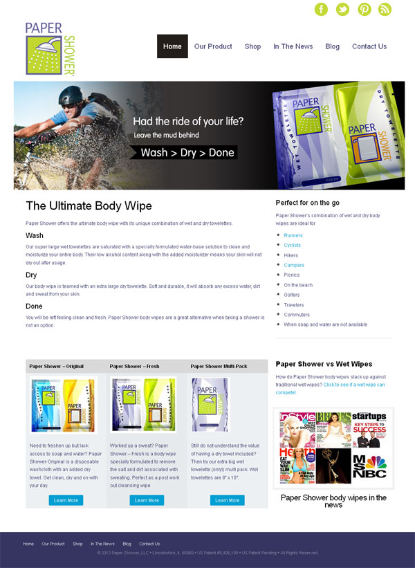
Paper Shower offers a range of unique body wipes which combine a large wet wipe with a dry towelette and are great for active people who are looking to freshen up on the go – bikers, runners, while camping, hiking and traveling or even on the golf course.
Why Redesign?
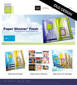 There are several reasons for the need to redesign a web site and the old Paper Shower site fulfilled quite a few.
Firstly the site was making the visitors work too hard to understand the product, it was only after clicking through from the home page that the concept of the product having both a wet and dry towelette became obvious.
Secondly, almost no consideration had been made as to who the product was being marketed towards – it was too generic.
Lastly the site was not at all optimized for the search engines, the home page itself was a collection of images and as a whole had very little keyword rich copy. Ranking in the search engines was poor and traffic was minimal despite great PR coverage the product has had over the last few years.
Our Web Re-Design Approach
Understanding the issues facing the old site helped us create a strategy for the re-design and re-launch of the new site.
Competitive Analysis
Any SEO project needs to kick off with a through understanding of the online competition. We took an in depth look at other body wipe websites and our analysis resulted in the compilation a list of favorable key phrases.
Web Content
We wanted to address several things with the web content
- Communicate the uniqueness of the product in a simple format that did not require the user any effort
- Engage with the target market of outdoorsy / active people
- Add more call to actions to purchase product
- Enrich it with target key words and phrase for SEO benefits
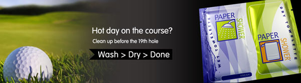
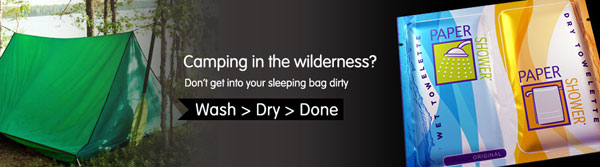
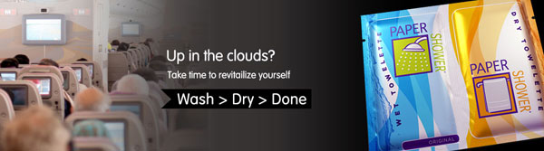
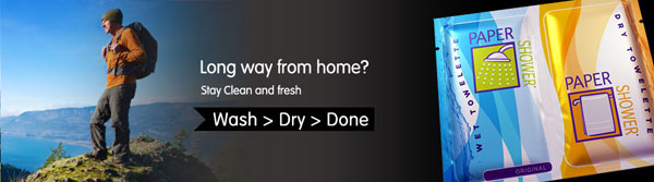
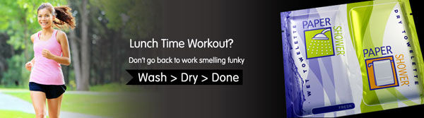
We started with the creation of a set of web banners that incorporated the product and an outdoor scenario or an occasion where the product would be useful. Each banner also carried the phrase Wash > Dry > Done, which was elaborated on with keyword rich copy underneath which quickly and easily explained the product.
The home page was updated to include more details of the product range and examples of who may find the product useful. We used video and client testimonials throughout the site for easily digestible communication.
For better engagement with the target audience we created a set of landing pages
- Post Workout Body Wipe – for athletes and sports men/women
- Cleansing Wipes for the Cyclist
- Body Wipes for Camping
and also added a blog
We are in the process of completing the internet marketing of the site but are confident that the re design and optimization will result in increased traffic and sales.
Read more about Paper Shower in our web design portfolio.
© 2013 Chicago web designer