


Having an outdated website can harm your business and potentially drive clients away, particularly if they are using a mobile device to visit a site that is not mobile friendly. Why go to all the effort of trying to read tiny text or battling with horizontal scroll bars when maybe your competitors offer a flawless mobile experience. Search engines like Google will always give preference to sites that are mobile friendly over those that are not, so search engines rankings and equity are also affected.
Many small business owners think that making a website mobile friendly requires a complete redesign and are put off by the costs of doing so. However with a careful “under the hood” re-code the look and feel of a site can often remain intact, with the coding giving it the functionality to respond to whatever device is being used to view it.
This is exactly the approach we took to updating the website for a Whytegate Farms, a Chicago based supplier of environmentally friendly cleaning supplies. They were perfectly happy with the look and feel of the site but were looking to make it mobile friendly
Here is the site before
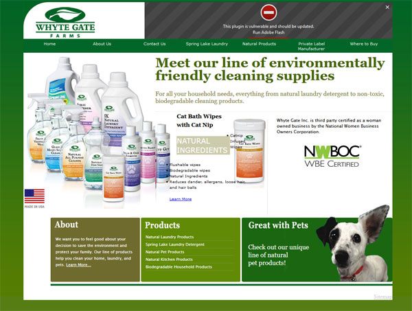
Not mobile friendly – desktop view

Not mobile friendly – Mobile view with horizontal scroll bars
And here is the site after it was re coded so that is responds to what ever device being used to view it.
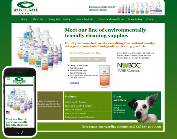
Mobile Friendly Website- Desktop and Mobile View
-

- Mobile Friendly
-

- Mobile Friendly – Slideout menu
We had to make a few minor design tweaks but overall the look and feel of the site when viewed on a desk top or laptop is the same.