WordPress.com Websites

WordPress.com websites ( as opposed to self hosted WordPress websites) are hugely popular. WordPress makes it very easy to get started and have a website up a running in no time at all, with essentially no technical know-how. Because of this they are an easy choice.

But getting a WordPress.com website to look and behave exactly as you want, can sometimes be a challenge when that technical knowledge or even just technical confidence is missing. The last thing you want to do is mess up your site!

I recently worked with Debbie Prather who was facing exactly this scenario with her WordPress.com website 742ILoveyou.com. She had a definite vision of how she wanted her site to look and perform and with the success of her articles there was a real need for her site to look more professional.

She reached out to me to help.

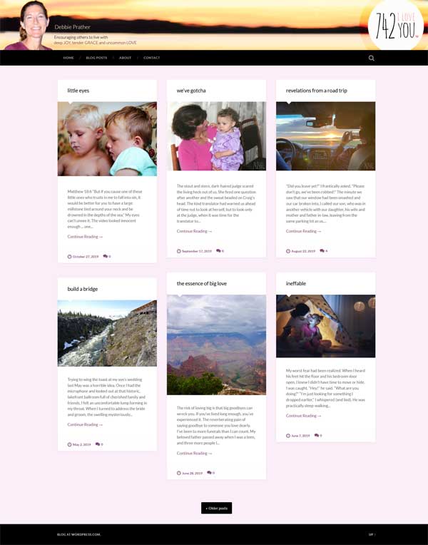
I actually forgot to screenshot the site before I started which is a shame but here is her site after I worked my magic.

I switched out the template being used to one that was more professional and added a branded header to the site which included a simple logo and tag line The home page was reconfigured to feature a grid view of the latest 6 blog posts. Follow buttons were added to the blog section and a new contact page added.

Overall the website is now much more appealing, easier to use and has the tools for readers to easily engage.

This is the review Debbie left for me on Google.

” I’m so very pleased with Indigo Image and the timely, professional way in which the improvements I requested were made to my website. I love the results and would highly recommend this company!”

If you have a WordPress.com website that needs taking up a notch I am happy to help. You can contact me HERE or call 636-795-7988

Need Help with a Wix Website?

I market myself as “A Creative Partner for your Small Business” and if your small business website is built using Wix, I can help by making it not only look wonderful but perform seamlessly too.

The Wix platform offers a drag and drop interface and is described on their site as “easy for any person to create websites – no design skills needed”. While it certainly offers plenty of tools to make a site look pretty, you really do need an understanding of how best to present your content to engage your users and encourage them down certain paths. This is where tapping in on the experience of a professional web designer can help take your Wix website to the next level.

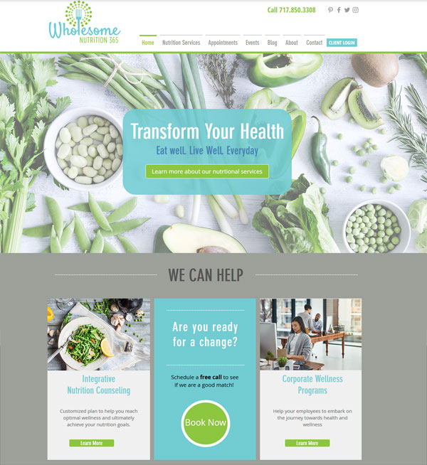
This was exactly what Malorie Blake,a registered dietitian based in York PA, was looking for her website Wholesome365.com

The re-working of her Wix site involved re branding with her new logo and complimentary color palette and font choices.

We also

  • Reorganized navigation for better content flow and usability and built out footer elements
  • Re-worked home page for improved information and call to action. e.g. Detailing major services and lead generation via a free phone consultation
  • Improved the design and added better call to action on inner pages of site e.g. Booking appointments or purchasing packages
  • Ensured design elements were consistent throughout site
  • Optimized pages and file names for SEO purposes

Here is the finished home page

wholesome nutrition wix website


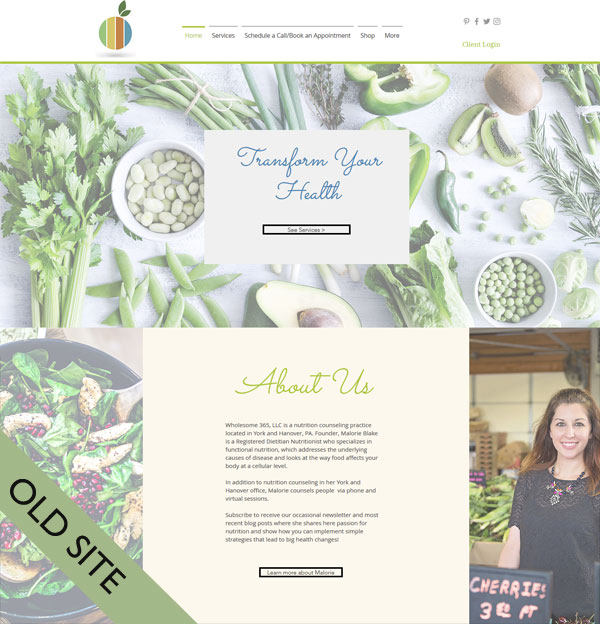
Compared to where we started from

As you can see the site is now far more focused on the user and how they can be directed to specific areas easily without having to think. The eye is effortlessly drawn in to the Call to actions

If you need help with a Wix website I am here to help. Give me a call at 636 795 7988 or contact me via email

Is Your Website Mobile Friendly?

Mobile vs Desktop

Here is an interesting fact, 2015 has seen mobile devices surpass desk top usage when it comes to accessing the internet – check out this article by Search Engine watch.

Google Responds

So it come to no real surprise that search engine giant Google will be tweaking its mighty algorithm to favor those sites that offer the best experience for mobile users. Effective April 21st mobile users will  receive search results that are relevant and optimized for their device essentially increasing the ranking of any site that is mobile friendly. Google claims these weighted results are only applicable to their mobile search results, but mobile friendliness clearly carries some clout.

Ahead of this announcement Google developed a handy online tool that will analyze a URL and report if the page has a mobile-friendly design.

You can test your site HERE

Time for  Mobile Friendly Website

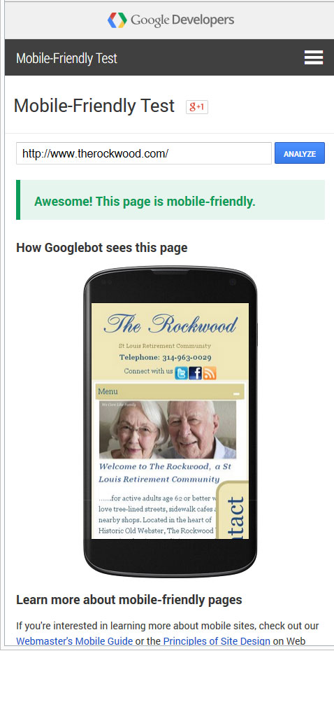
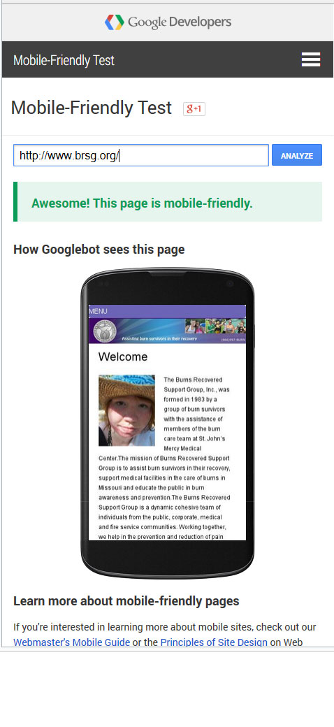
If your site passes and gets the “Awesome! This page is mobile friendly message” then all is well. But if you get the dreaded “Not mobile-friendly” result , then your site will be penalized in Google mobiles search engine results.

As a small business owner if search engine traffic is an important part of your marketing plan then now is the time to act and get your web site mobile friendly. Contact us today to find out how

Examples

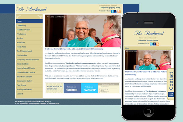
We have done just this for two of our long standing clients, both original site failed the Google test, but now they both get the coveted “Awesome” notice.

The Rockwood is a St Louis senior living Community.

responsive-web-design-google-algorithm-change-rockwood

therockwood-mobile-friendly
Burns Recovered Support Group offers support to burns survivors
responsive-web-design-google-algorithm-change

burns-mobile-freindly-website

If you are interested in making your site mobile friendly contact us today


A to Z of a Great Website

CHICAGO WEB DESIGNER

A is for Architecture
A great website starts out with a well thought out information architecture. This is best done with pencil and paper before a pixel ever hits the screen.

B is for Blogging
The benefits of blogging are many. A blog offers a great platform for quick updates, got a new product, won and award, got a great testimonial, blog about it. Interact and build relationships with your visitors through comments. What’s more the search engines love blogs, content is king and fresh content rules the roost.

C is for CMS
CMS stands for content management system and is an application which allows clients to update  sites themselves. If you are looking to make regular updates to your site it is wise to have your site built on CMS application and this is something your web designer will need to know up front. There are many CMS systems out there, WordPress, Joomla, Dot Net Nuke, Drupal to name a few.

D is for Domain Name
Yourcompany.com,  gone are the days when it was easy to get a domain name of your choosing as so many are already in use or have been “reserved”.  Select your domain name carefully.

DO

  • Pick one that is short and sweet
  • Get the .com version
  • Protect yourself, purchase the same domain name with additional extension such as .org, .net, .biz etc. the last thing you want is someone else using the same domain name for a similar business.
  • Try and get a domain name that includes one of your most important key words or phrases. This is what I have done with my Eye of the Chicago web designer blog http://www.ichicagowebdesigner.com

Don’t

  • Select a very long winded domain name
  • Use hyphens

E is for Email
Many times people visiting your web site are much more comfortable contacting via email than picking up the phone, so it is important to offer an easy to find contact email on a site. Don’t use a personal yourname@aol.com type email,  it looks unprofessional. Make  use of that carefully selected domain name, something generic like info@yourcompany.com work best.

F is for Facebook
Facebook has become a very popular platform for social networking. If it is a tool you intend to use as part of your marketing strategy make sure visitors to your site can connect to your Facebook profile directly from your site.

G is for Google
Lets face it Google is the mother of all search engines but Google offers a wealth of tools useful to both surfer and website owner alike. e.g Google Analytics is an excellent web statistics application which provides information of the number of visitors to your web site, which pages they are visiting, what key word or phrase they used to get there etc. All it requires is a small snippet of code added to a site.

H is for Hosting
Having a good reliable hosting company with which to host your site is crucial. The last thing you want is your site to be down because something has gone pear shaped at the hosting company. We are big fans of CrystalTech.

I is for Internet marketing
Internet marketing is the process of essentially “getting your site out there” and driving traffic to it. Listing it with the search engines, managing pay per click campaigns, email blast campaigns, setting up social networking profiles, advertising via banner ads. etc.

J is for Junk
It almost goes without saying that if you have a web site then you are going to get junk email. Spamming  is a monumental pain in the rear end. However there are steps you can take to minimize its invasive nature.

  • Make sure your email account has a junk or spam folder. These can be easily set set up on at the webmail level and with careful filtering ( usually recommended by the web hosting company) a junk folder can filter out a large amount of spam. Do make sure you check it occasionally as sometimes genuine emails do get stuck there. To minimize this set up a trusted sender list so their emails will never go to the junk folder.
  • A lot of spammy junk can come through contact forms. If this is a problem on your site a CAPTCHA  element and script can be added to verify the sender is a human and not a spam bot. A CAPTCHA element is a small image string you have to type in before submitting the form.

K is for Keywords
Key words or phrases are those words that you want to trigger the listing of your site within the search engines. To work best, key words will be woven into the code and within the copy of your site. Phrases work better than single words as words can be too generic and produce such an abundance of listed sites your site will be lost.

L is for Links
Got links? The more sites link to you the better your standing within the search engines, but they have to be quality links from reputable sites to count. One way to built quality links to your site is to comment on blogs with links to your products, services, relevant information. Don’t be spammy though or you are just wating your time.

M is for Metadata
Meta tags such as Title, content, keywords, description are included in the code of your site and can be used by the search engines when it comes to ranking your site.  Google uses the title meta tag information to return results for a particular search.

N is for Navigation
The navigation for a web site should be intuitive and employ the “don’t make me think ” principle.  Text navigation is much better that an image based navigation as the search engines can “read” it and it is easier to update.

O is for Optimizing
Search engine optimization is the art/science of tweaking a website to maximize it’s potential, generally in relation to key words and phrases. e.g if one of your key phrases is “coffee cup cakes” it is much better to name the file related to your product “coffee-cup-cakes.html”  rather than just “cakes.html” The same principle applies to name image files.

P is for Passwords
Make sure you use good strong passwords to access anything you need to log in to. Add numbers, characters upper and lower case letters. Don’t use the same password for everything or anything obvious such as “password1”

Q is for quality
Quality counts, does the design of your web site look professional,  is the copy well written and concise?

R is for RSS
Got a blog? then you have a RSS feed ( Really Simple Syndication) which enables your content to be easily distributed via blog readers such as Google reader or even delivered to readers via email. You can subscribe to this blog here .

S is for Search engines
The one we all know and love is of course Google , Yahoo and Bing are the other two biggies. It is important your site be listed with these three But there are plenty of other search engines out there and the more search engines with which your site is listed the better.

T is for Twitter
Twitter is a micro blogging platform and another great social networking application to add to your marketing mix. Use it to build relationships, interact with your site visitors, announce news, new blog posts etc. Twitter is free and your Twitter home page can be customized to match your brand image. Follow us on Twitter

U is for URL
URL or “Uniform Resource Locator” is the address of your web site on the world wide web e.g https://www.indigoimage.com/index.html

  • http://:  type of file
  • domain name:  location of the file’s web server is at indigoimage.com.
  • backslash,then file name /index.html

V is for Visitors
Your site needs to offer the best experience for your visitors as possible.

  • Is it compatible for all browsers and platforms?
  • Is it fast loading? – you have just a few seconds to make an impression or your visitors will be hitting that back button
  • Is it free of technical errors, broken links, missing images, scripts that don’t run?
  • Are there call to actions?

W is for Webmaster
A webmaster will help you manage your site to keep it at optimum performance and up to date.

X is for XML

OK X was a bit of a challenge for this list. XML is a Extensible Markup Language; a flexible text format for creating structured computer documents. We use XML on a regular basis for submitting sitemaps to Google.

Y is for Youtube

Video is a fabulous way to add an extra dimension to your marketing mix and while there are lots of video sharing sites out there the most popular is YouTube. You can set up your own channel ( follow us here) upload your videos and embed them within your site.

Z is for Zoe Feast

A great web site starts with a great website designer, contact me,  Zoe Feast, to see how I can help you today.
Telephone: 847 607 8679

2010 © Chicago Web Designer
Do you need a professional Web Designer?

Creating a web site must be easy, something you can do yourself over a weekend , right? Your nephew/cousin/admin assistant has just taken a six week class in web design at the local community college, are they now  fully qualified to produce that highly polished web site for your small business?

In all likelihood if you take these routes you will end up with a sub standard web site which, at its worst, can be detrimental to your business. It’s much better to call in the pros but what are the advantages of hiring a professional web designer?

To put it simply they know what they are doing. Consider the following

Design

Creating the look and feel of a web site is not just a case of opening Photoshop and playing around with a few pixels. A web designer will understand how to engage your visitors, enable them to navigate effortlessly all this while  considering the complexities of coding the design-what is and is not possible. How many pixels wide should the site be, what fonts are web safe, how should the files be saved, optimized for fast download.  What are the latest design trends? What type of design will appeal to your end user.  A web designer will be continually asking themselves questions as they design.

Coding

Coding involves rendering the design into a form that can be understood by web browsers. A professional web designer will be an expert in HTML and CSS and well versed in platform such as WordPress,  content management systems -CMS ( e.g Joomla) and be able to work with any shopping cart e.g PDshop.net.  They will constantly test the coding to iron out any bugs and make sure of cross browser compatibility.  Your site will look good irrespective of what browser of platform you are viewing it on. They will also remain up to date with all advances in the coding arena so you know your site will not be using outdated techniques.

Launching

The nuts and bolts of making a web site live,  registering a domain name, opening a hosting account, configuring email, stats packages. All bread and butter to a professional web designer.

Internet Marketing

Having a site which ranks well for particular key phrases is on the wish list of most, if not all clients. Search engine optimization (SEO) is the first step to achieving that goal and this end game will have been in the forefront of the designers mind as early as the design phase of any project. From researching the best keyword phrases, to naming files to optimize the potential of those phrases. What’s considered white hat (best practices) and what not do ( black hat practices) Getting the site listed is the next step, whether through organic ranking or paid placements through advertisers like Google. If social networking is part of your marketing plan your designer will help you implement.

So which route to take, the DIY  or the PRO approach?

I can guarantee by hiring a professional web designer you will end up with a far more effective web site.

2010 © Chicago web designer

Top 5 Reasons for Redesigning a website.

We hear ” I need my web site redesigned” quite a bit these days.  While there are many reasons here are our top picks.

  1. I need my website to look more professional.
    Looks are everything and online you have just a few seconds to make that all important first impression. A well designed fast loading web site can do wonders to encapsulate your expertise and reach and engage your target audience.
  2. We need our content reorganized.
    If your site visitors are having click through page after page to get to the information they want, you are making then work too hard. A web site with intuitive navigation and well organized content = “a don’t make me think visitor”
  3. My web site is not doing what I want it to do.
    Whether you want your site to act as a lead generation tool,  a portal of information, or a selling platform, it is important to guide or funnel the site visitors exactly where you want them to go via “call to actions”
  4. I need to add some additional functionality
    Want to add a blog, additional pages, links to your social media networks? A well thought out web site will always be able to accommodate additional functionality without a complete redesign but sometimes there comes a point  when a redesign is the best options.
  5. I want my site to perform better in the search engines.
    The structure and design of a web site  bears a huge relation on how well a site performs in the search engines and a skilled web designer will know how to optimize all elements that make up a web site, for best search engine results.

Now lets take a look at these  in action with three before and after web redesign projects.

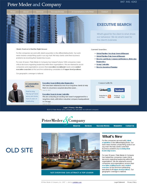
Peter Meder and Company

We addressed all 5 reasons in the redesign of a web site for Chicago headhunter, Peter Meder and Company.  The new site has a much more professional look/feel and immediately imparts the nature of the business.   Visitors have easy access to the current position searches which is a huge time saver for both client and job hunter.


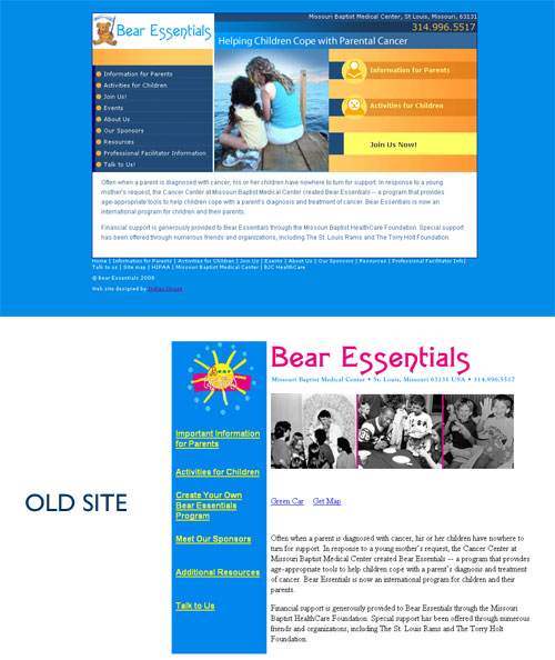
Bear Essentials

Content reorganization was the main driver behind our redesign of the Bear Essentials web site. We produced a much more appealing user friendly site with clear call to actions.


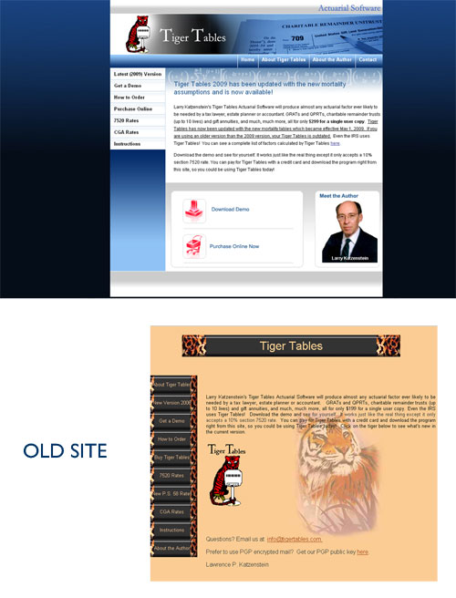
Tiger Tables

A more professional look was the order of the day for our redesign of Tiger Tables with clear call to actions.

Do you have a web site that could do with a makeover? We’d love to have an opportunity to talk with you.

Call us at 847 607 8679

2010 © Chicago Web Designer

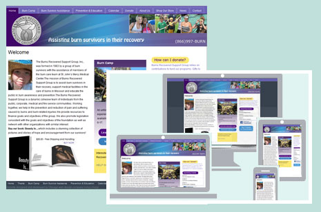
New web site for Burns Recovered Support Group of St Louis

Remember this post ” Pro Bono Web Design” at the beginning of June? Well the web site for Burns Recovered Support Group is now live. Visit it here www.brsg.org

We went from an outdated this:-

to a slick, all singing and dancing this:-

A fresh new look and feel, the design of the site has  focused on getting the site visitor to where they want to go quickly and without making them think, via simple drop down navigation and bold buttons on the home page.  Built on the WordPress platform, the client is able to easily update the site, whether it is adding a new event or a batch of photographs. Burn camp 2010 is just three weeks away so stay tuned to see new photos of all the happy campers.

2010 © St Louis Web Designer

Banner Ads on your website

If you are a website designer or an owner of a web site that offers advertising this post is for you.

website advertising 4 ideas

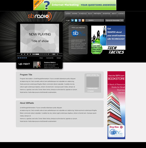
Yesterday I revealed a branding project I have been working on which included the creation of a logo, business card, website and banner ads. An important part of the website was that it be able to accommodate banner ads as this was to be a major source of revenue for the site.

To refresh your memory here it is again
website sbradio
Designing a web site with ads  in mind poses a  challenge. You need a site with conflicting call to actions.

Call to action A

Engaging your site visitors with your site’s content – happy surfer and web site owner

Call to action B

Encouraging your site visitor to leave your site by clicking on a banner ad – happy advertiser

So how do you design a website to  please both surfer and advertiser? Successfully accommodating banner ads into a web site is all about balance between space,  size, color and movement.

Space and Size

There are industry standards for the size and shape of Ad units suggested by Interactive Advertising Bureau (IAB).  This list of acceptable shapes and sizes is growing each year but to create a website to accommodate all  is not wise.  A better approach is to pick a few of the best performing sizes/shape (do a search to see the current hot list) and create your website design around those blocks.

The thoughts of ads on a page can sometime conjure up an image of clutter and disarray but careful spacing and positioning of the  units can optimize the performance (click through) of the ad, while minimizing the invasive effect they have on the surfer.

Color

The banner ads provided by the advertisers are likely to be multi colored and certainly not designed to compliment a web site with a complicated color scheme.  The best approach is to keep the color scheme of your site monochromatic, in the case of the SBradio site we selected tones of gray. This approach helps the ads pop, happy advertiser, but enables the site visitor to easily switch focus to the site content, happy surfer.

Movement

Many banner ads have an element of movement, either a flash animation or a rotating gif.  To overcome the competing effect of an animated element it is best to ensure the host web site has no or little movement itself.

So ads vs content, let the competition begin!

2010 © St Louis Web Designer

Website first impressions: New site for Breeze Law Firm

You have one chance to make that all important first impression, are you achieving that with your web site?

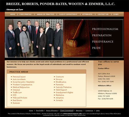
The updated site we’ve created for Breeze Law Firm delivers a great first impression with a rich look/feel, easy to navigate interface and direct copy allowing visitors a thorough overview of the practices areas.

Visit the site a www.breezelaw.com

Custom 404 error pages.

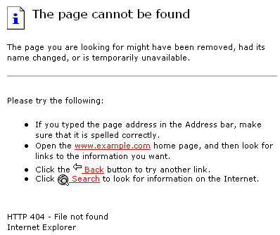
Does your web site have custom error pages? If a visitor types in the address of a page that has been moved or no longer exists are they greeted with this?

Does this screen engage your users? No and you are missing an opportunity to direct your users to the information they are looking for.

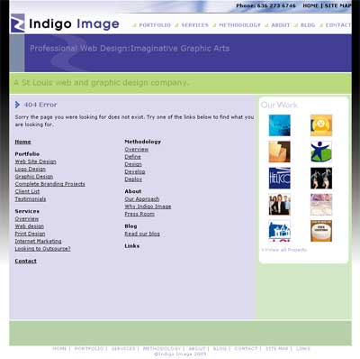
Take this “error” opportunity to present your visitors with custom 404 error pages, ours has full site navigation and a site map.