We hear ” I need my web site redesigned” quite a bit these days. While there are many reasons here are our top picks.
- I need my website to look more professional.
Looks are everything and online you have just a few seconds to make that all important first impression. A well designed fast loading web site can do wonders to encapsulate your expertise and reach and engage your target audience.
- We need our content reorganized.
If your site visitors are having click through page after page to get to the information they want, you are making then work too hard. A web site with intuitive navigation and well organized content = “a don’t make me think visitor”
- My web site is not doing what I want it to do.
Whether you want your site to act as a lead generation tool, a portal of information, or a selling platform, it is important to guide or funnel the site visitors exactly where you want them to go via “call to actions”
- I need to add some additional functionality
Want to add a blog, additional pages, links to your social media networks? A well thought out web site will always be able to accommodate additional functionality without a complete redesign but sometimes there comes a point when a redesign is the best options.
- I want my site to perform better in the search engines.
The structure and design of a web site bears a huge relation on how well a site performs in the search engines and a skilled web designer will know how to optimize all elements that make up a web site, for best search engine results.
Now lets take a look at these in action with three before and after web redesign projects.
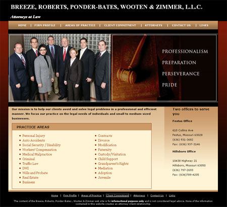
Peter Meder and Company
We addressed all 5 reasons in the redesign of a web site for Chicago headhunter, Peter Meder and Company. The new site has a much more professional look/feel and immediately imparts the nature of the business. Visitors have easy access to the current position searches which is a huge time saver for both client and job hunter.

Bear Essentials
Content reorganization was the main driver behind our redesign of the Bear Essentials web site. We produced a much more appealing user friendly site with clear call to actions.

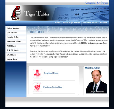
Tiger Tables
A more professional look was the order of the day for our redesign of Tiger Tables with clear call to actions.

Do you have a web site that could do with a makeover? We’d love to have an opportunity to talk with you.
Call us at 847 607 8679
2010 © Chicago Web Designer


