Updated website for St Louis Author

I am honored that so many of my clients come back to me for repeat work, even moving from St Louis to Chicago 5 years ago ,did not destroy the relationships I have built up.

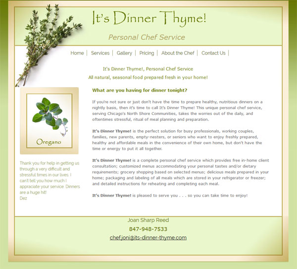
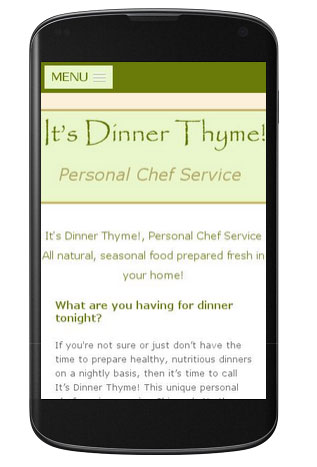
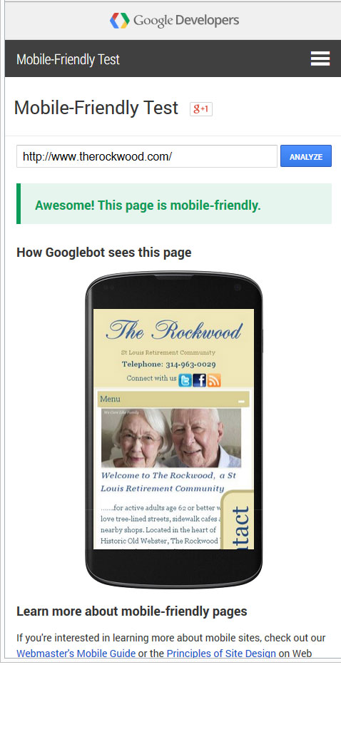
I have been working with Cynthia Reeg, a St Louis Children’s author, since 2007 and was delighted recently see an announcement that she had got a new book deal for a trilogy. It had been a while since her website had been updated and she contacted me looking to take her site to the next level. She wanted to not only update the content and promote her new book but to have the ability to self manage the entire site and develop a fan base which she could market to. The new site needed to be mobile friendly too

I am always up for a challenge and love it when a client comes to the table with a well thought out list of wants!

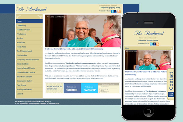
Her old site was static based but incorporated a Blogger blog. Moving forward with Blogger was not ideal so the decision was made to move to the WordPress platform as the content management capabilities are far superior. I built a custom responsive template based loosely on the look and feel of her old site (why change it when she was happy with it) and imported all the posts from blogger.

book-author-mobile-website

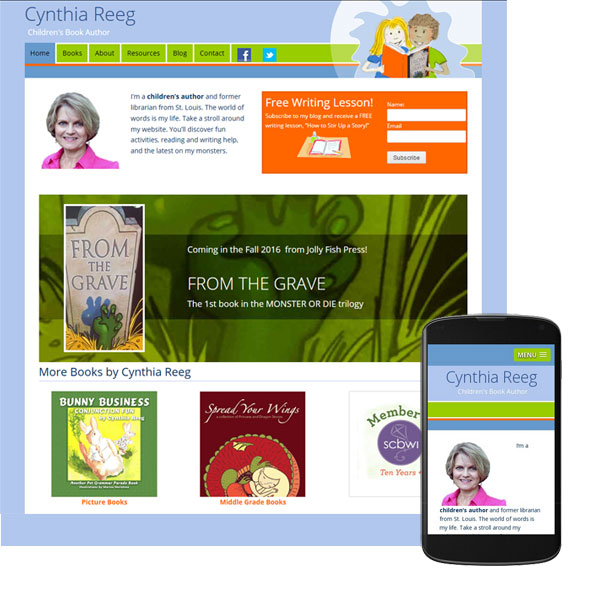
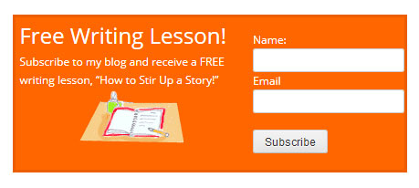
The pages were given a fresh more modern layout and a prominent call to action was include. It encourages readers  to sign up for her blog and in return they receive a free writing lesson. The call to action is tied in with an email blast program so her fan list can be easily managed and marketed to.

email marketing call to actionbook-author-mobile-website-inner

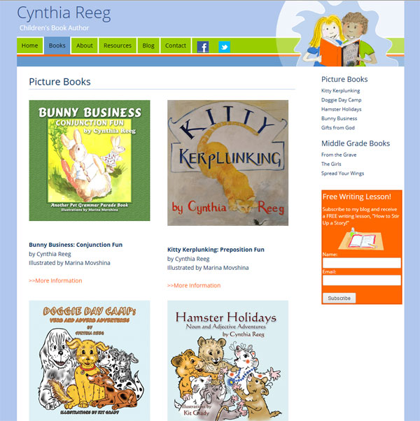
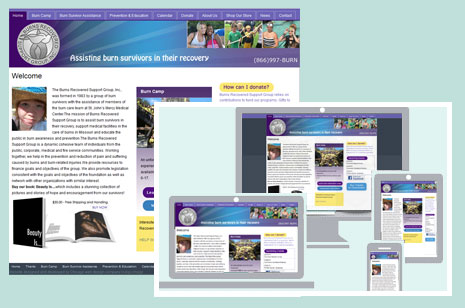
Check out the updated site at cynthiareeg.com

Making your Website Mobile Friendly

A client recently contacted me with a problem they were having with their site. They had  understood the need to be mobile friendly but had taken the approach of having all mobile users directed to a stand alone third party app. The problem was it  had been built for them by a company that had now gone out of business and they were unable to make any changes.  Mobile users visiting their site were be directed to an app which had outdated information, including that all important telephone number! Considering now that mobile devices make up for more traffic than desk top devices, this was turning into a huge problem for them.

My solution to their problem was two fold.

  1. Firstly I stripped out all the code in their site that was causing mobile visitors to be directed to the defunct app, better to reach a site with correct information even if it isn’t mobile friendly..
  2. Secondly I did some major “under the hood” work on their WordPress template, converting it to a template that responds beautifully whatever device is being used to view it.

roberg-tax-solutions-mobile-website

The design of the desktop version of the website stayed almost identical …they were more that happy with that aspect of the site and didn’t want to change it.

Mobile friendly problem solved! Check out their new mobile friendly responsive web site

New website for Northbrook Dr

We recently launched a new website for a Naprapathy doctor, Dr Daryl Newman – www.chainreflex.com

Based in the North Shore area of Chicago, Dr Newman offers unique treatments and programs to help patients move better and feel better. Naprapathy is a non invasive method for treating and managing pain, everything form back aches to carpal tunnel and Dr Newman combines treatment with custom exercises unique to a patient’s problem.

He also offers customized fitness training – Chain Reflex, and wellness programs including weight loss, pre and post natal and sports nutrition.

North shore naprapatic web site

Given that most people do not have a clue (me included when I first met Dr Newman) what naprapathy is, we approached the creation of the website based on how treatment could help specific problems. The home page features a slideshow with distinct patient scenarios leading to targeted call to actions.  We also included a section titled “How can we help you” with more scenarios such as ” I am in pain and looking for relief”.  As the visitor delves deeper into the site a better understanding of what naprapthy is and what to expect are gained. The site is sprinkled with an amazing set of testimonials that speak volumes of the skill Dr Newman offers.

The design is clean and uplifting reflecting how patients feel after a treatment session. It  is built on the WordPress framework which will allow Dr Newman to easily update, he is also going to be writing a regular blog – a great way to market a site.

pain-treatment-northbrook

It is also completely mobile friendly.

Visit it a www,chainreflex.com

Mobile Friendly WordPress Websites

Last week I launched three new web sites… and they were all related to food., what more I have another three foodie websites in the works. Is this why I always seem to be hungry at the moment? I have already blogged about new mobile friendly web site for a Deerfield personal chef, but today it is the turn of a pair of wholesale food distribution site, School Lunch Solutions and University Food Source.

Both sites act as online catalogs for an inventory of wholesale food, one is geared towards the schools and the other the University market.

We built them on the WordPress platform which will allow the client to easily update products and nutritional information, up to this point it has been a cumbersome process!

The look and feels were similar.

Here is School Lunch Solutions

school lunch solution mobile freindly web site

school-lunch-solutions-website-inner

and here is University Food Source

university food Source mobile freindly website

university-food-source-website-inner

Both sites are mobile friendly.
ufs-mobile

New Mobile Friendly Website for Deerfield Personal Chef

I was recently contacted by a personal chef looking for someone to update her website, she had been let down by her previous web designer and was now looking to work with someone local.

Her website was clean and nicely designed but needed some content updates and to be converted so it would be mobile friendly.

Keeping the look and feel almost identical we did a lot of “under the hood” work recoding it so it is now more friendly for the search engines and performs beautifully on mobile devices.

its-dinner-thyme-mobile-freindly-website

its-dinner-thyme-mobile-site

We also added a gallery of the type of food she prepares which is definitely  worth checking out! Visit http://its-dinner-thyme.com/

Here is what Joan had to say

“Please know how grateful I am for your help in updating my website”

Is Your Website Mobile Friendly?

Mobile vs Desktop

Here is an interesting fact, 2015 has seen mobile devices surpass desk top usage when it comes to accessing the internet – check out this article by Search Engine watch.

Google Responds

So it come to no real surprise that search engine giant Google will be tweaking its mighty algorithm to favor those sites that offer the best experience for mobile users. Effective April 21st mobile users will  receive search results that are relevant and optimized for their device essentially increasing the ranking of any site that is mobile friendly. Google claims these weighted results are only applicable to their mobile search results, but mobile friendliness clearly carries some clout.

Ahead of this announcement Google developed a handy online tool that will analyze a URL and report if the page has a mobile-friendly design.

You can test your site HERE

Time for  Mobile Friendly Website

If your site passes and gets the “Awesome! This page is mobile friendly message” then all is well. But if you get the dreaded “Not mobile-friendly” result , then your site will be penalized in Google mobiles search engine results.

As a small business owner if search engine traffic is an important part of your marketing plan then now is the time to act and get your web site mobile friendly. Contact us today to find out how

Examples

We have done just this for two of our long standing clients, both original site failed the Google test, but now they both get the coveted “Awesome” notice.

The Rockwood is a St Louis senior living Community.

responsive-web-design-google-algorithm-change-rockwood

therockwood-mobile-friendly
Burns Recovered Support Group offers support to burns survivors
responsive-web-design-google-algorithm-change

burns-mobile-freindly-website

If you are interested in making your site mobile friendly contact us today


New Website for Chicago Consulting Company

Launched today is a new website for Lighthouse Consulting, a Chicago based business consulting firm.
Lighthouse consulting Chicago business consultant
We designed a clean look and feel incorporating a slide show on the home page which was inspired by guiding light sources and drives users to inner sections of the site that are applicable to their particular challenges.

The architecture of the site was designed specifically around the challenges business owners face.

Lighthouse consulting: business challenges facing Chicago business owners

The site is responsively coded and powered by WordPress.

New WordPress Site for Chicago Interior Designer

Last week we launched is a brand new wordpress web site for Chicago interior designer, Suzanne Falk.
wordpress website interior designer chicago
Suzanne works with a wide range of clients, from  homeowners, to  businesses and she is also currently focusing on a project for the DIY/HGTV network.

The websites launches her new product “Kitchens 2 Go“, a shopping list to DIY your own designer kitchen. She is offering complete shopping lists for traditional, transitional and urban chic styles, in both warm and cool color palettes.

It also features a selection of her TV work, including episodes of HGTV’s Kitchen Crashers’s

wordpress website interior designer chicago

Many of her stunning interior design projects are showcased in a large portfolio.

wordpress website interior designer chicago