


I am one of those people who dislikes having a messy desk, piles of paper and clutter distract my creative juices. So my office is a place of order and serenity

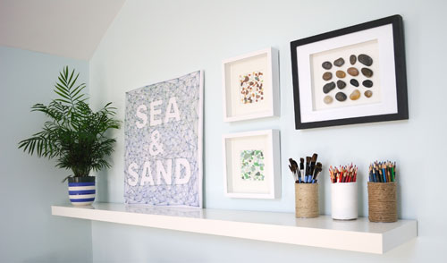
and in true creative fashion I have made all the artwork on the walls.
I am one of those people who dislikes having a messy desk, piles of paper and clutter distract my creative juices. So my office is a place of order and serenity
and in true creative fashion I have made all the artwork on the walls.
We have been offering Responsive Web Design services for quite a while now, so we really should take a rap on the knuckles for the fact that our own website did not behave responsively.
That is until now.
Client work always takes precedent over any other work, so that is our excuse for the tardy conversion of our site to a fully responsive website.
Our site is a great showcase of how an existing web design can be converted so that it behaves responsively – optimizing the users experience no matter what they are using to view the site, desktop, laptop, tablet or smart phone. We made no changes to the design or look and feel of the site but all the work was done on the code which powers the site – under the hood so to speak.
This is how it looks on a desk top,

here it is on a tablet,

and here it is viewed on a smart phone

You can experience this yourself just by re-sizing your browser window ( Firefox and Chrome work well for this).
This type of coding conversion can be readily achieved on most websites. If you are looking to convert your web site into a responsive web site we offer a free review service. Contact us today or call 847 607 8679 to get started.
I’d like to give a shout out today to my client Burns Recovered Support Group who have just published a truly stunning book, Beauty Is…
The book is a collection of photographs of burn survivors and is aimed to inspire others, who have suffered burns, in the realization that there IS a light at the end of the tunnel and that their lives will move forward.
Each photograph is accompanied by a short paragraph which details the age the burn occurred, the age in the picture and a description of what happened.
It is priced at $35 and is currently available for purchase here

Congratulation to everyone who made this book happen.
I want my clients to be thrilled to bits with the work I create and when I get a recommendation like the one below ( also on LinkedIn) I know I have succeeded.
![]()
“Quadra Applications & Technology, Inc. hired Zoe & her firm Indigo Image to design and develop our new company logo. Zoe’s strong business, technical, and multi-industry experience, coupled with her creativity and customer focus, was truly remarkable! From the onset of the project, Zoe outlined the process steps, project timelines, and cost estimates which in all cases were spot and exceeded all of our expectations. Additionally, Zoe went above and beyond her role as lead logo designer and provided critical Web development and integration advice to optimize the quality and user experience of our new site (www.quadra-ati.com). We look forward to engaging and collaborating with Zoe and her team at Indigo on future projects and customer initiatives. It is not easy to find resources that can combine technical expertise, in-depth business knowledge, creative ‘out of the box’ thinking, with a strong passion around quality and customer satisfaction!”
John White
Quadra Applications & Technology
There comes a time in the life of every web site when a re-design is in order. This can be driven by a new brand image, making better use of advancing web technologies or simply the need to provide a better organizational structure.
Needing to re-organize was the driving force behind a design shake up of Creative in Chicago, a craft and home decor blog and the outlet for my personal creative endeavors.
When I first started this blog I opted for a quick and easy Blogger template, simply adding a custom header and working with the template designer to add a unique background and set the blog layout. It was fully functional but not the most appealing site in the world, but as I had no idea if it was something I was going to write on a regular basis, I didn’t want to invest a load of time in setting it up.

As it turns out the blog now has over 200 posts with over 30K visitor a month and was in dire need of a shake up, so it underwent a redesign . For regular blogging I generally recommend using WordPress but because I did not want to spend more time than necessary, I decided to stick with Blogger.
During the redesign process I wanted to address
In re-designing a site I wanted to keep some semblance of the original site so not to completely alienate my readers with something totally new and unexpected. I kept the background patterns and type face of “Creative in Chicago” the same but completely reworked the header, creating a little more pop with the use of color and simple design elements and also integrated social media icons and RSS feed subscription.
I also moved away from the full post format on the home and category pages. Instead the reader is now offered a summary of each post with an thumbnail picture. It is much easier to see at a glance the content of the site.

Although I had been using categories to define content there lacked a definite structure which I could use as navigational tool. I reassessed and ended up with five main categories : Art – Crafts projects – Decorating – Free Stuff – Garden projects and within these categories I defined a number of sub categories. For example the category Decorating has five sub categories: Before and Afters – Painting – Decorative Accents – Wall Art Ideas- Windows . The navigation bar was reworked to include these main blog categories, with drop down elements for the subcategories. A search bar was also prominently placed. Posts that were buried deep within the blog are now much more accessible.

I decided to incorporate Google Adsense into the site and allotted a spot high on the sidebar for placement. I wanted a position that would work both well for click throughs but not to be too invasive for my readers. I am also experimenting with in-line advertising through infolink. Both are working nicely!
Fortunately Blogger makes this really easy and it is as simple as selecting a pre-made template to display when anyone accesses the site with a mobile device.
Here is a sneaky look at a new web site we are working on for a Chicago custom home builder.
The client has provided an abundance of photos and we have been spoiled for choice when it comes to selecting which ones to use. During the defining stage of the project we discussed color palettes and the idea of taking inspiration from a slate roof with copper gutter was born.

The project is in development stage of our process and should be live in a few weeks.
Launch today is a freshly re-designed website for AED Battery Exchange aedbatteryexchange.com. Located in the far north suburbs of Chicago, they are leading the way in re- celling batteries for Automated external defibrillators and wanted a web site which truly matched their innovative product.
Also on their want list was a professional looking site which was easy to navigate and appealing to their target audience.
We created a very clean look and feel, the home page featuring an eye catching Call to Action banner to “Find your AED battery”.

They batteries were categorized in terms on manufacturer and featured images which can be enlarged so the user can clarify the correct battery.

The site is definitely a step up from their old one

Here is another project which showcases the consistent use of image branding elements as I talked about in my post Brand Image Tips for Small business Owners.
I started working with Restore North Shore, a Chicago remodeling company, a few years back …creating a set of basic brand image elements for them … logo, color palette, type face selection. These element were then integrated into a website and more recently I have created Lawn signs, Car Magnets and t-shirts, working from the elements I originally established.


And here are the branding elements all working together, delivering a strong and consistent look for this small Chicago business.

If you would like help building a branded image for your small business we are happy to help, learn more about our branding services or contact us today
There is something very satisfying about redesign projects. We were contacted recently by Chicago based Quadra Applications & Technology, who were looking for a new logo design. They already had a new website in the works and felt the time was right for a revamp of their identity- their main request was something that looked more professional.
In redesigning a logo it is not uncommon to work from some element of the old logo, whether it be the color palette, style of font or icon. In the case of Quadra we adopted the cube of their original logo, reworking it to encompass a sphere and connective framework. Teamed with a modern open typeface the new logo is much more fitting for the IT market they serve.
![]()
![]()
and here is the logo on the new website www.quadra-ati.com

Interested in some other logos we have designed? Check out our Logo Portflio
I talked yesterday about the elements of Brand Image and how building a style guide can help ensure your brand image elements are used in a consistent way thus ensure a strong brand image.
Well here is a great example of using brand image elements consistently, in this piece of work I completed recently for MAC. The look and feel of this product sheet fits in beautifully with the rest of their promotional pieces, website, business card etc. by using a predetermined color palette, typeface typesetting, layout and logo treatment.

Collection of other graphic design pieces produced for MAC
